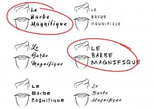
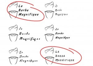
So I feel like I’ve decided on a simple look for the logo (I’ll look into this in a later post) so what’s next is to decide on the perfect font style. I created a set of 12 designs each with the same logo but different type. The images below feature the ones I decided on (circled in red) as well as the other tests.
1 – Dry Brush
2 – Master of Break
3 – Amsterdrum Grostek
4 – Fuga de Cerebros
5 – Awesome as F**k
6 – Stackyard
Of these font types I decided to go with the first and fifth. To me they seemed more professional yet they matched the style of the brand, quirky, unique and fresh. The other types seemed ‘comic-y’ and distracting as well as being fairly hard to read. I want a certain amount of formality with the font as well as having it being easy to read and quirky.
1 – ArtBrush
2 – The Citizens
3 – Guld Script
4 – Olympic Branding
5 – Ventography
6 – Bruss
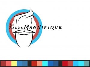
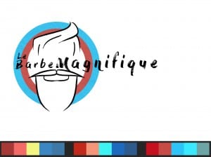
With these, I picked the first and sixth font. Once again I picked them due to their professional and formal stance. The others, like the page before, seemed too childish and they reminded me of comic sans (which is a no go) as well as being too distracting. The two that I’ve selected make the logo look more attractive and formal towards customers. Below I’ve created some test logos with two of the fonts just to see how it looks. Personally I prefer the second one due to the quirkiness and the formal feel that it gives off. To me, the font speaks a sense of formality and makes the barber shop look like they know what they are doing.


