Category: Branding (page 1 of 4)

Critical Evaluation – Branding and Book

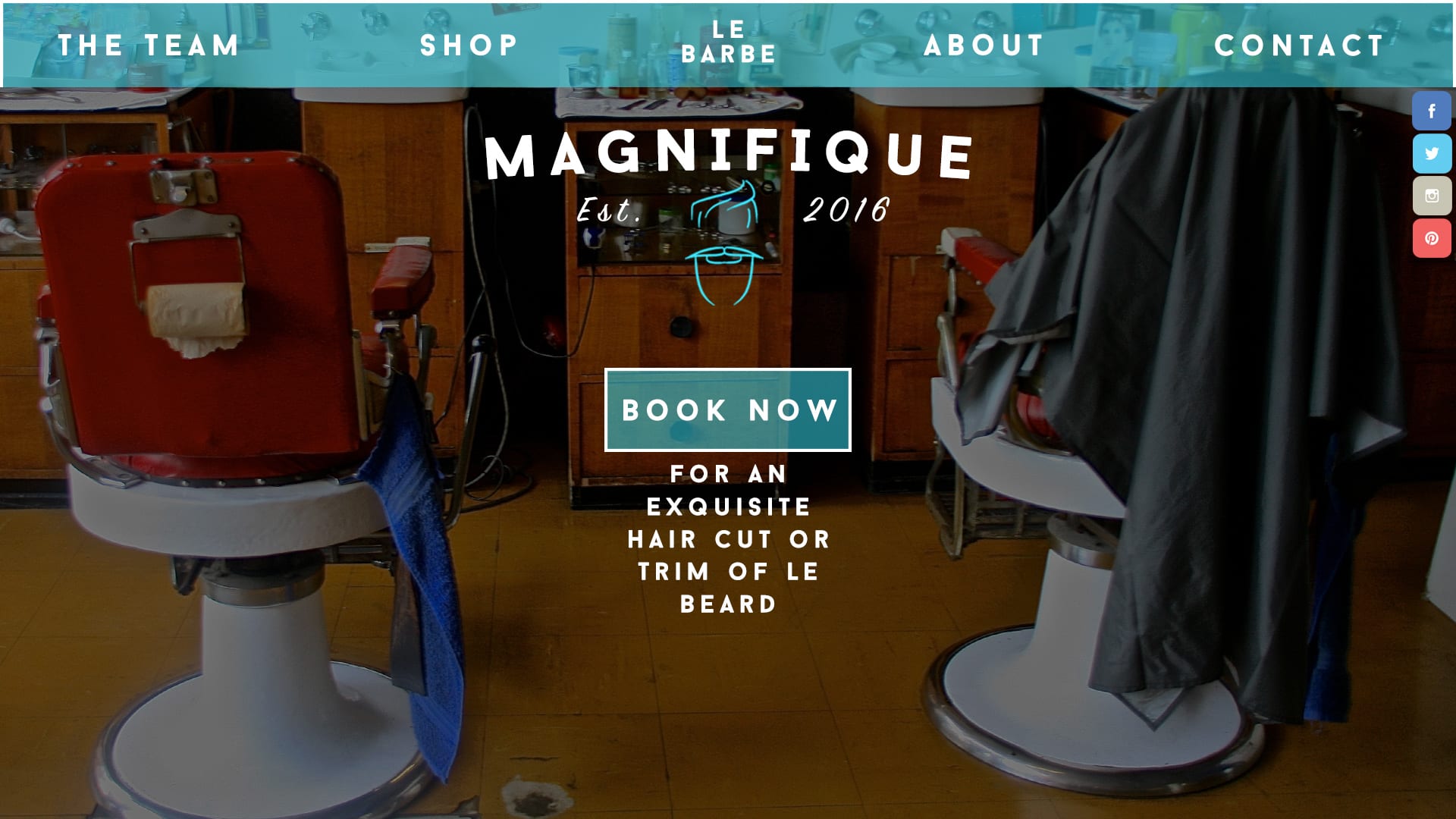
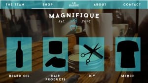
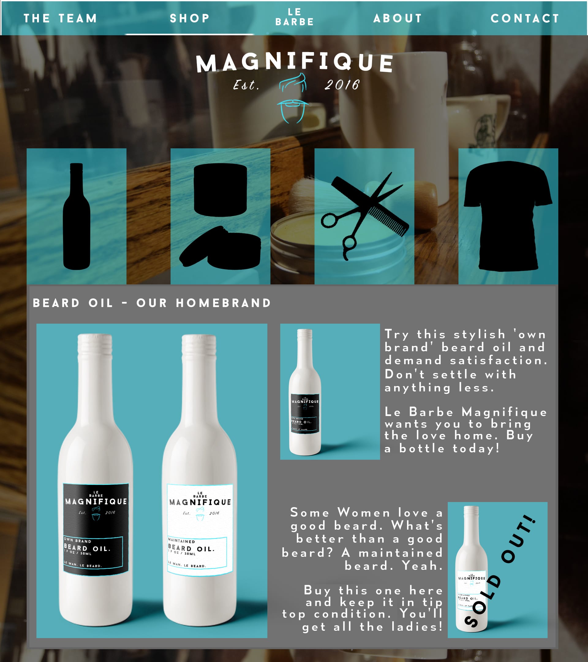
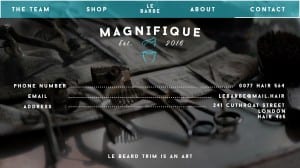
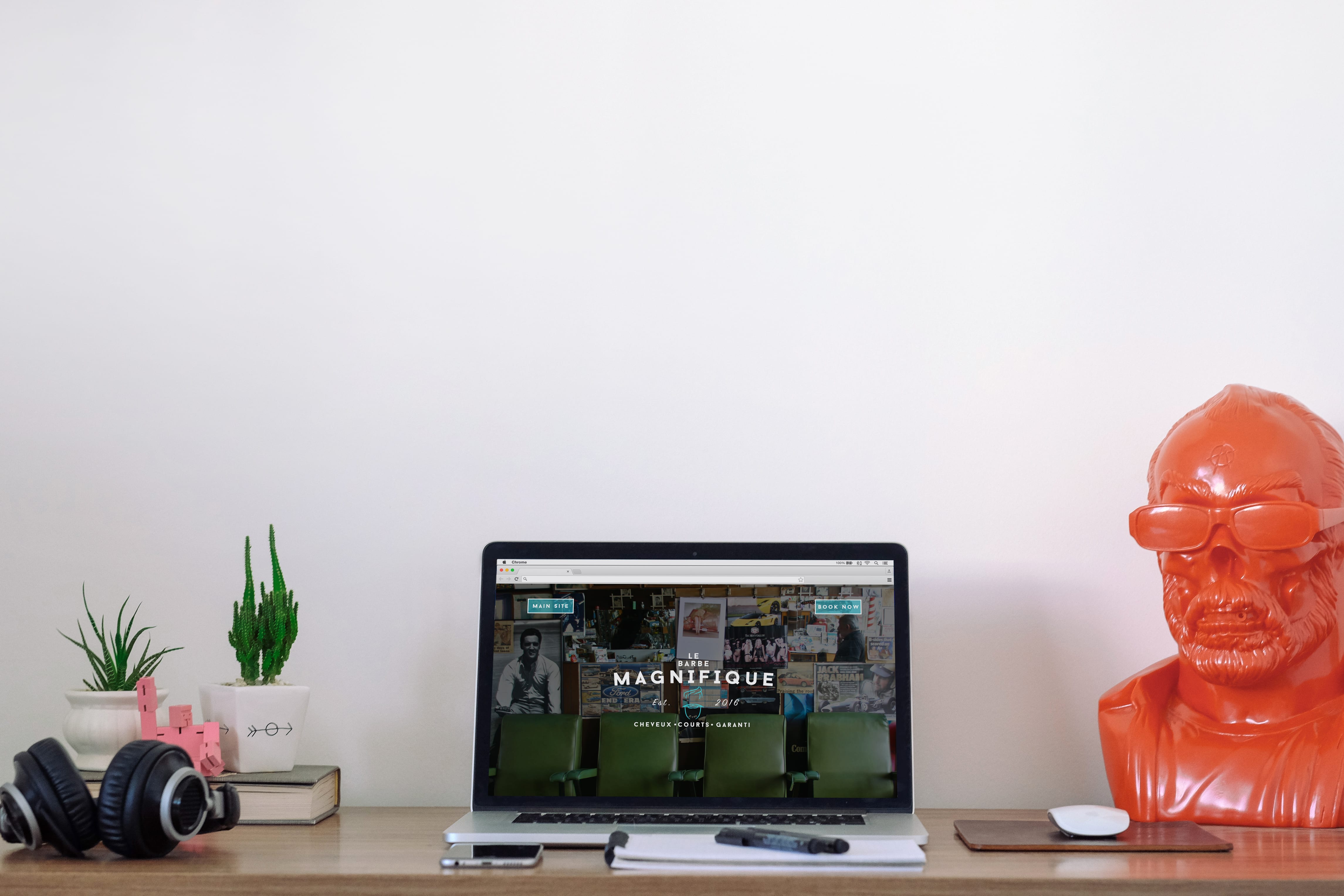
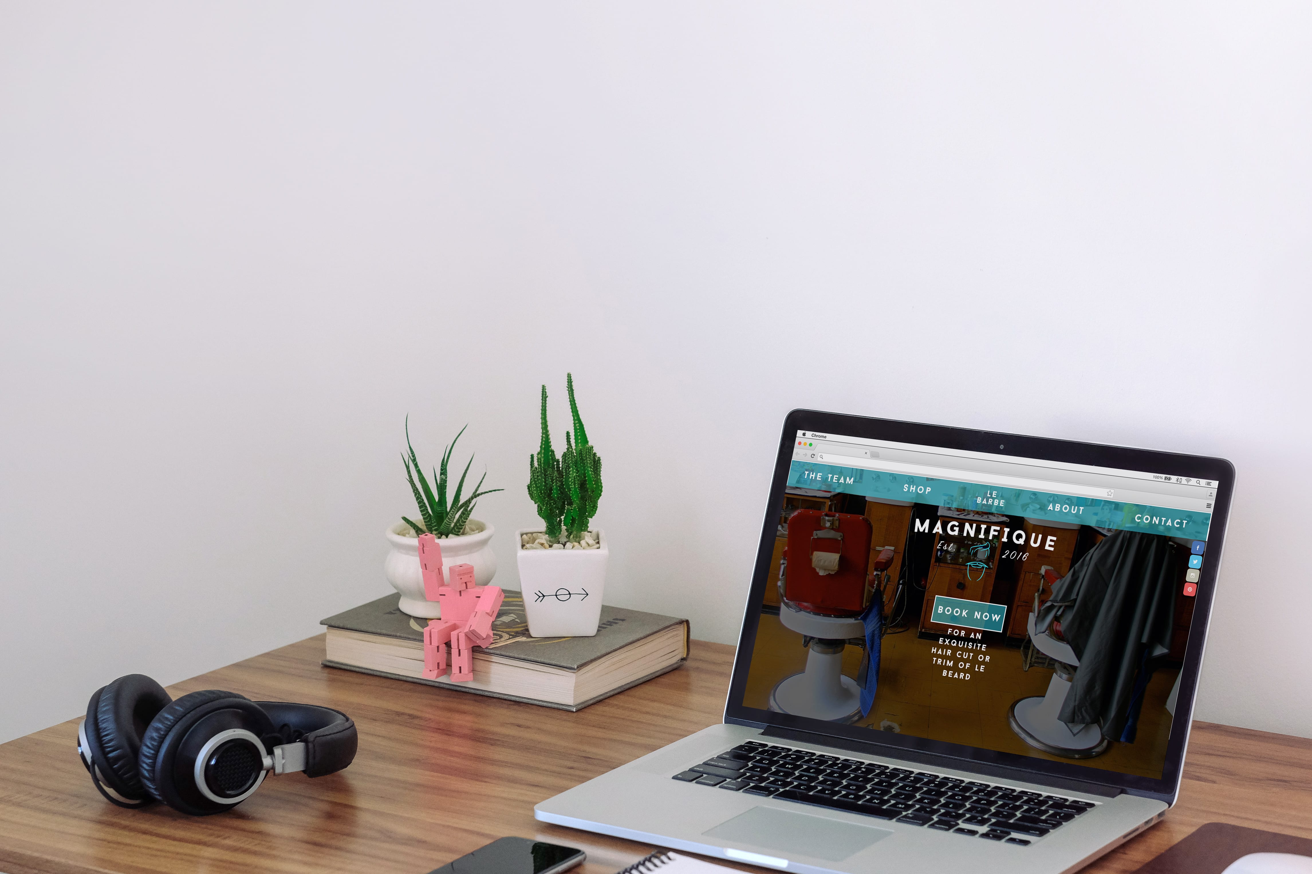
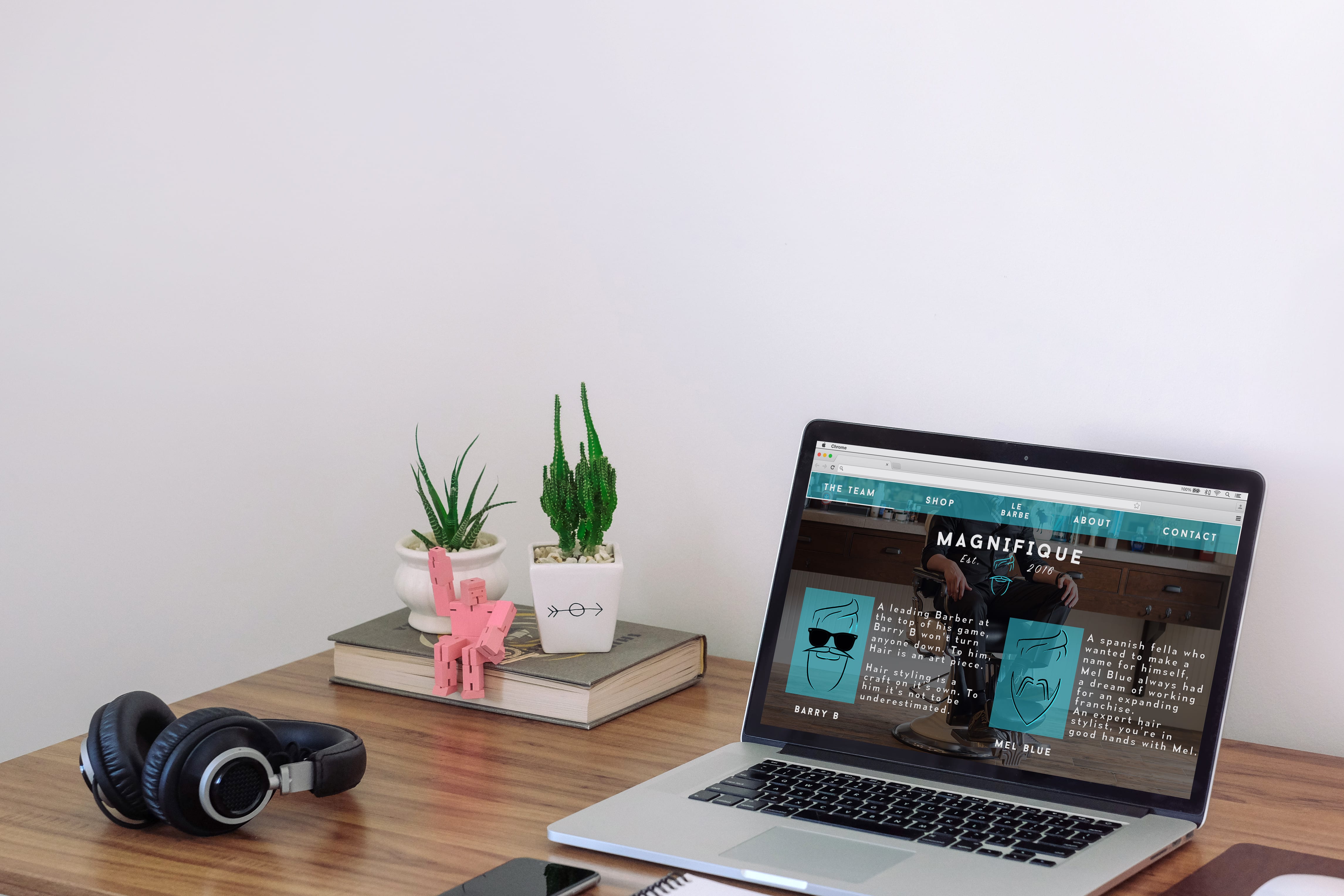
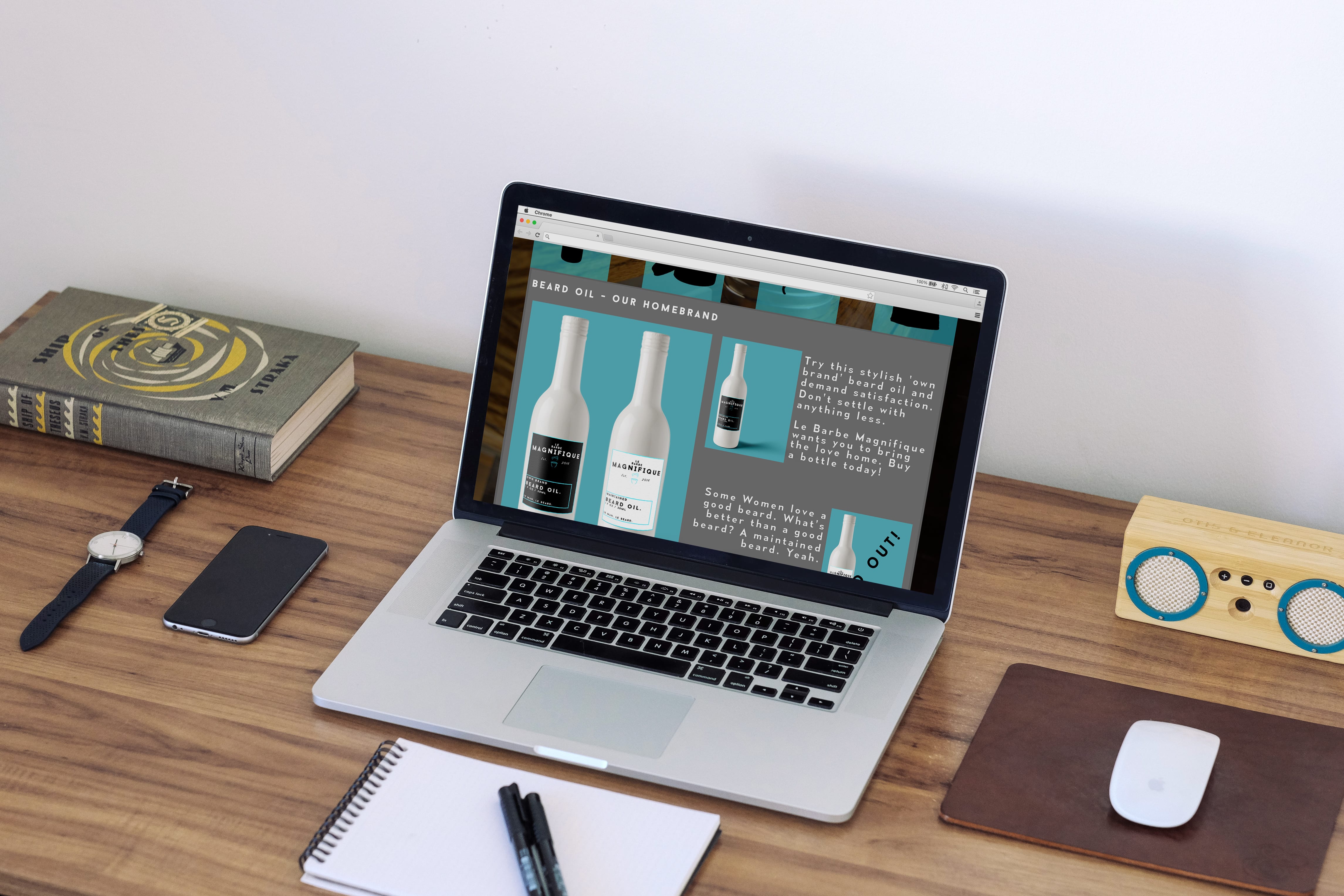
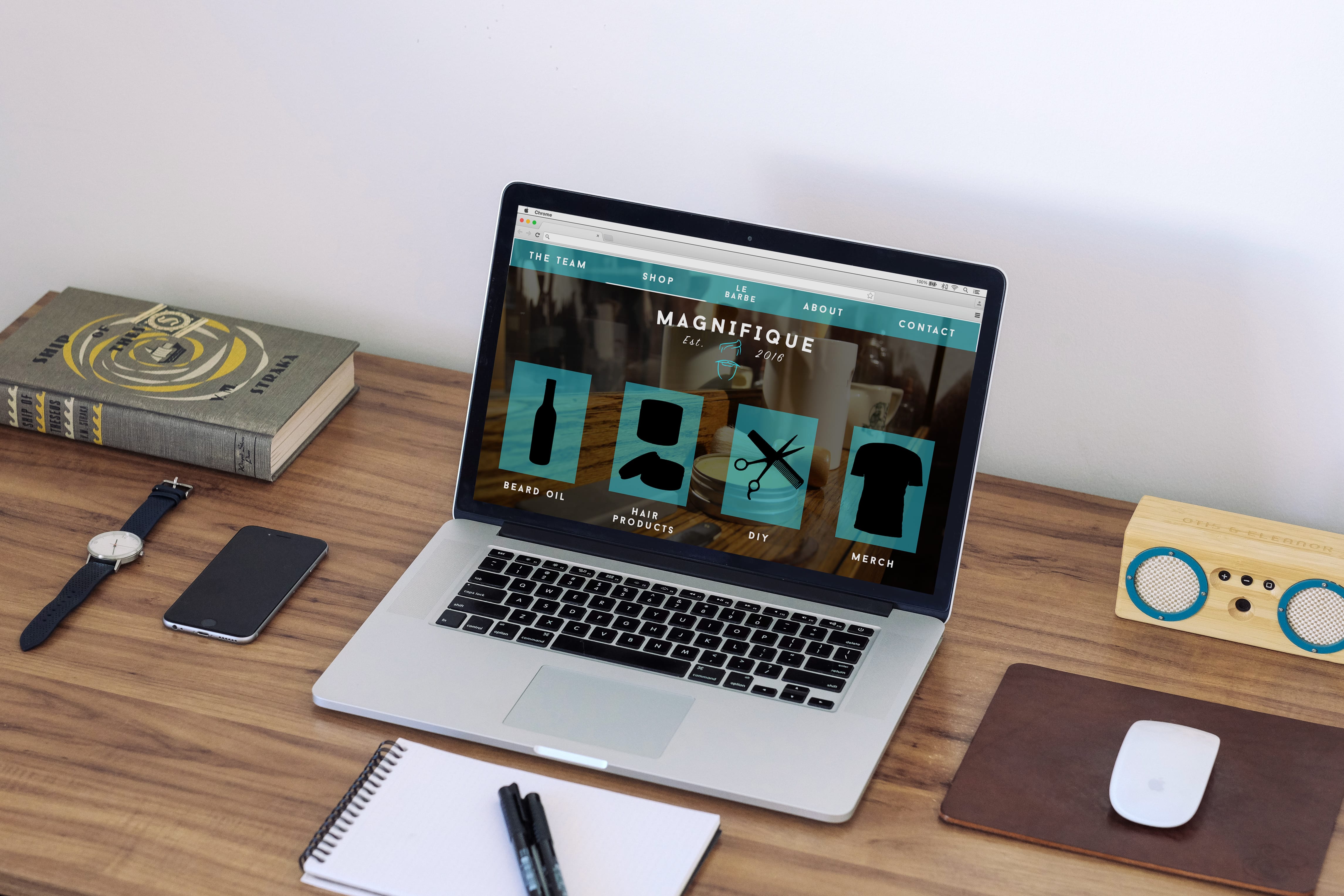
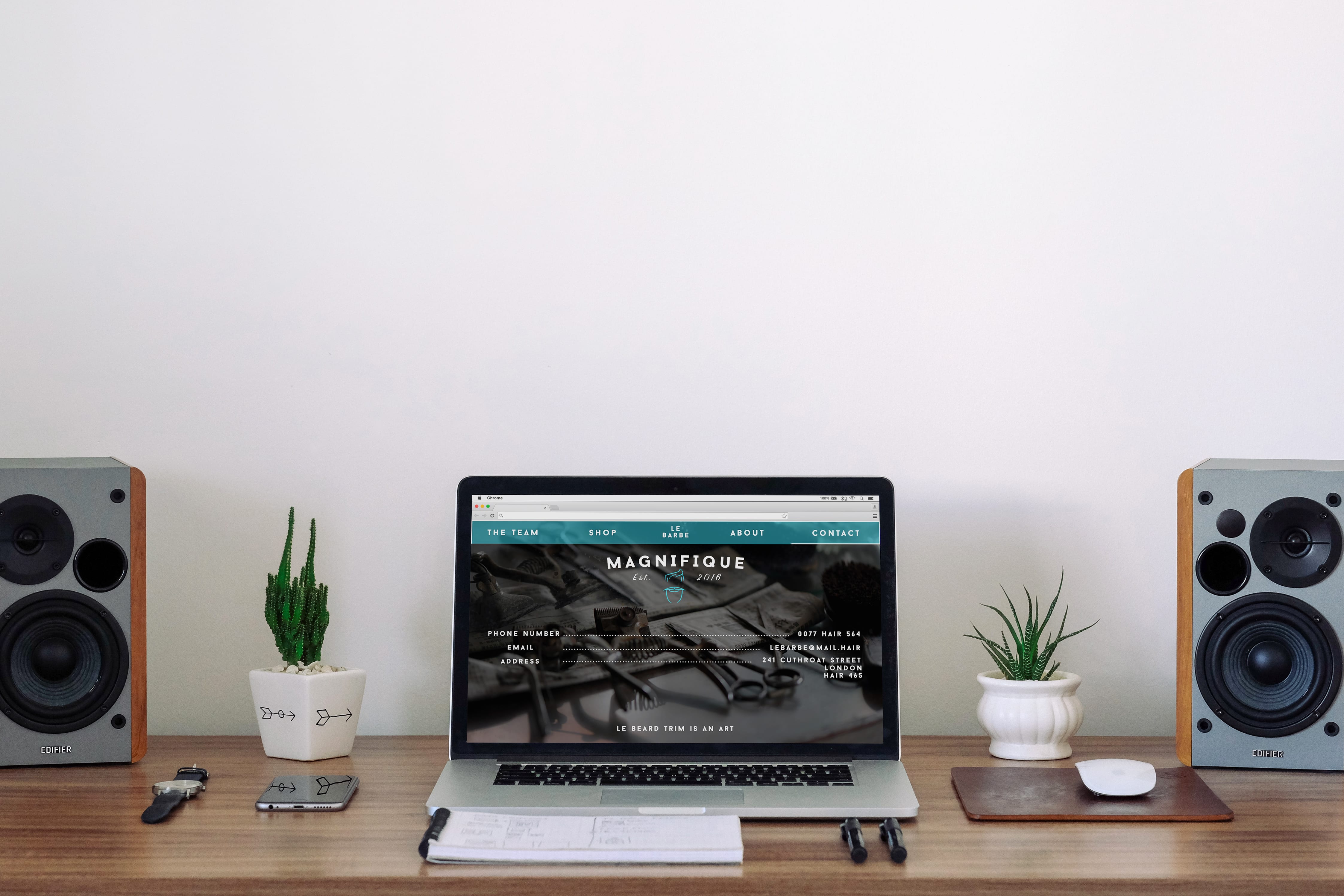
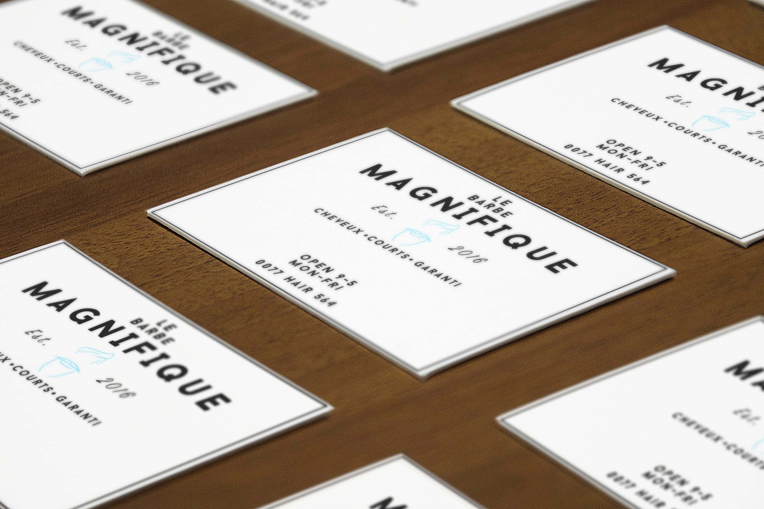
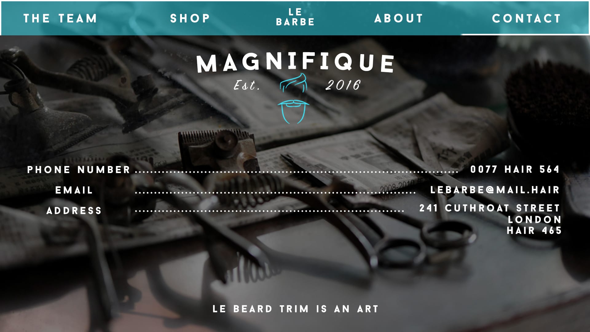
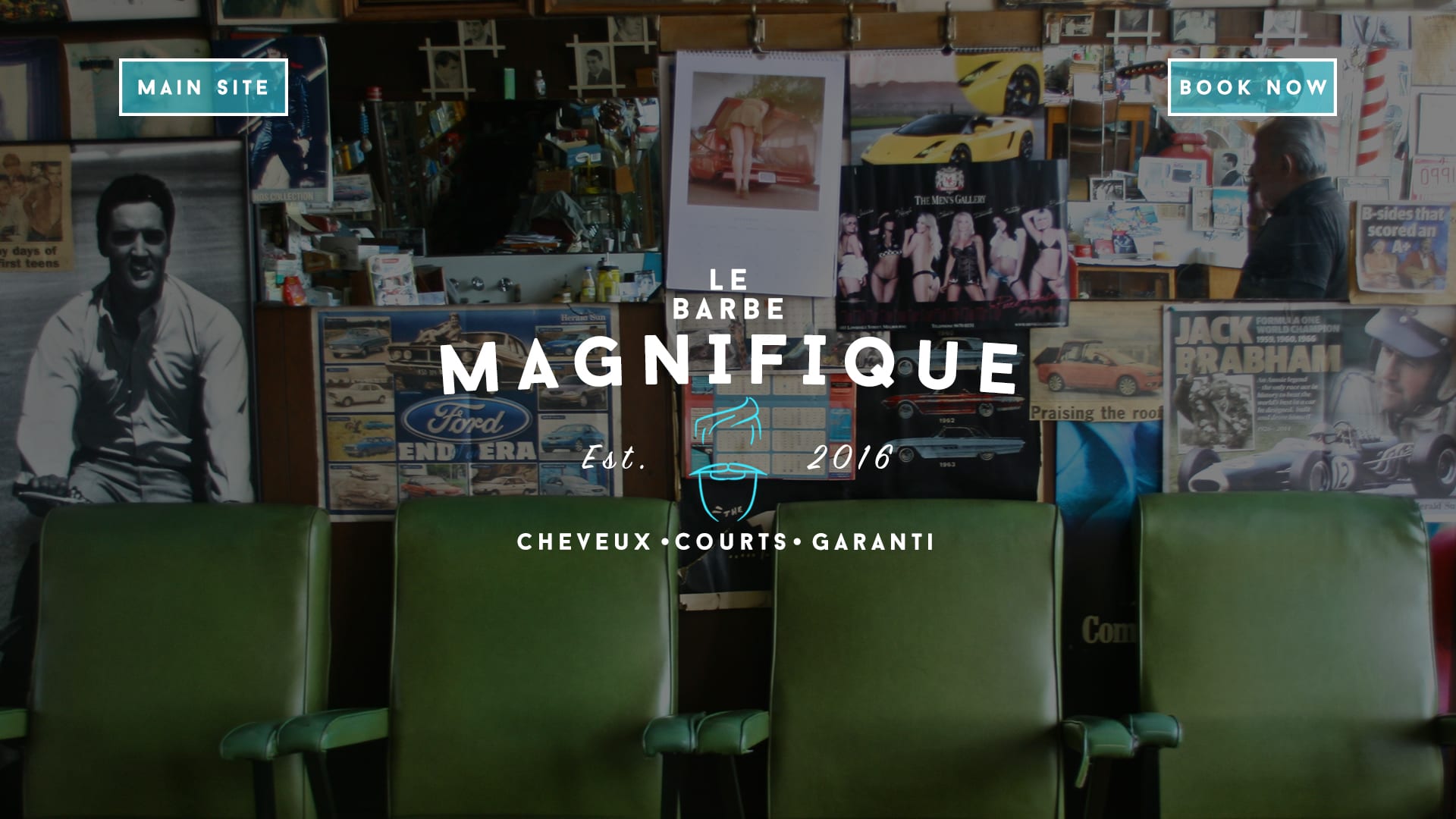
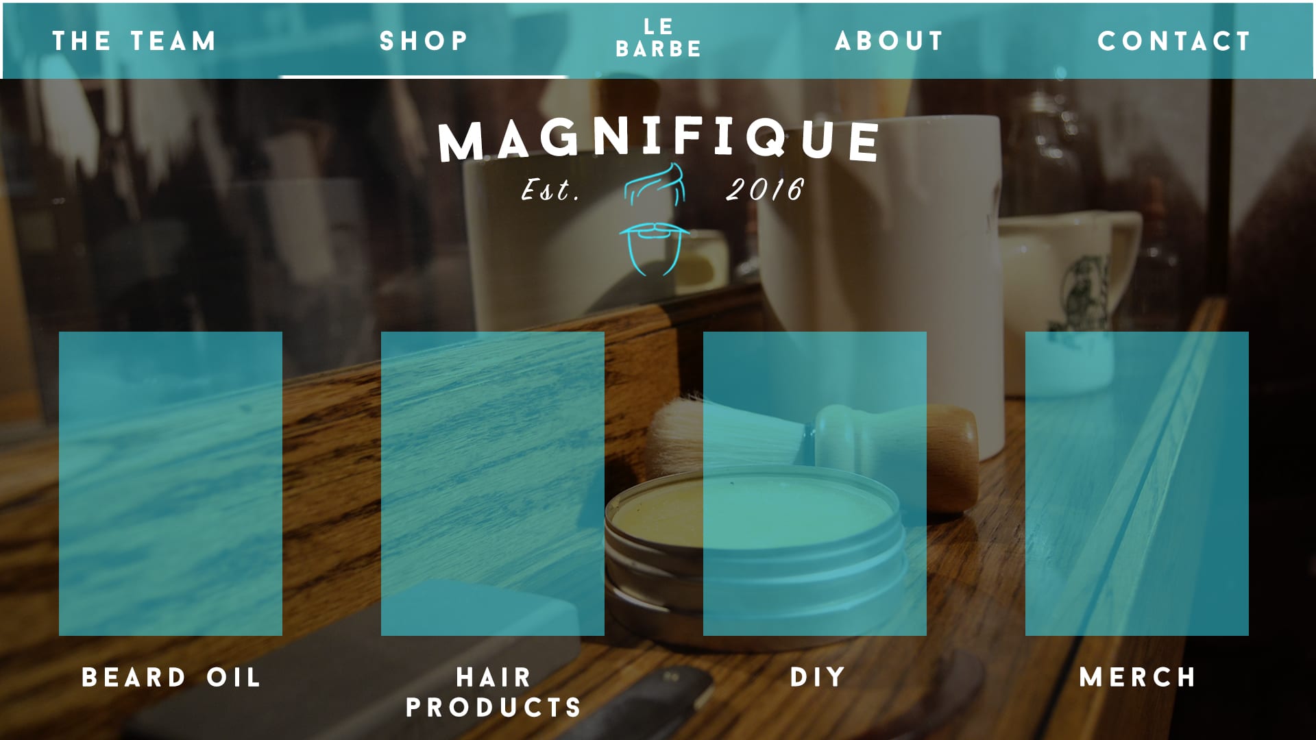
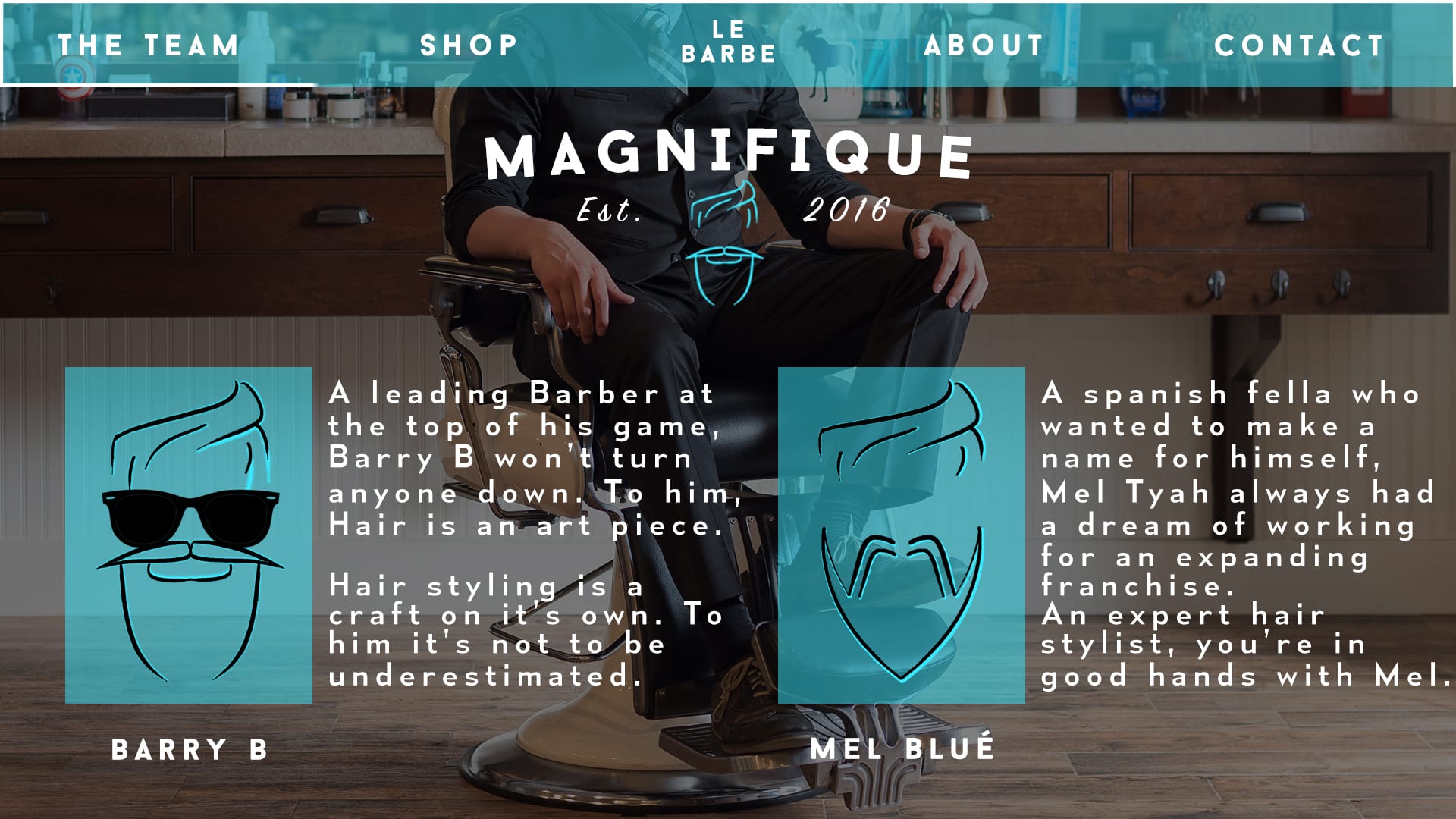
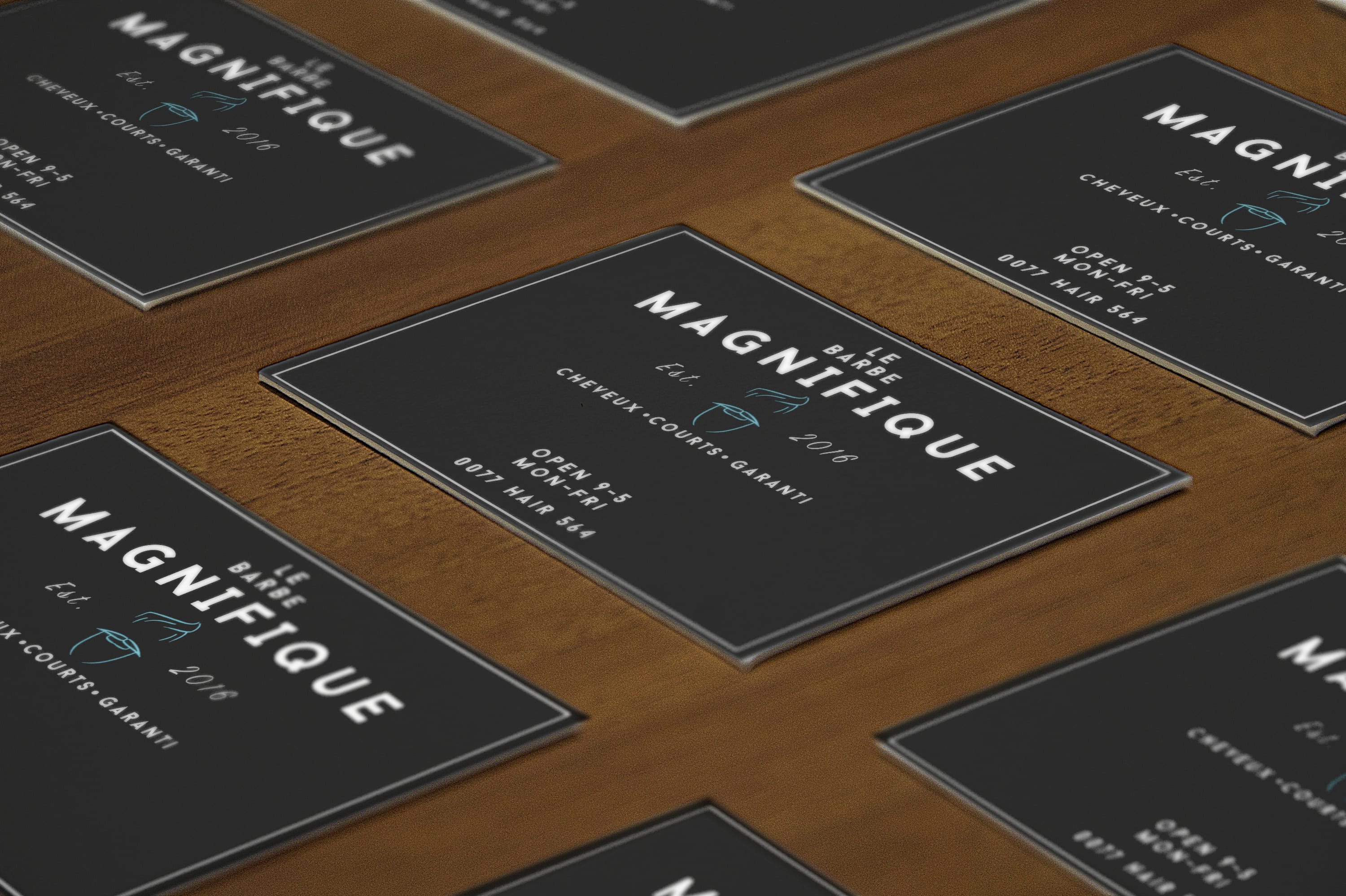
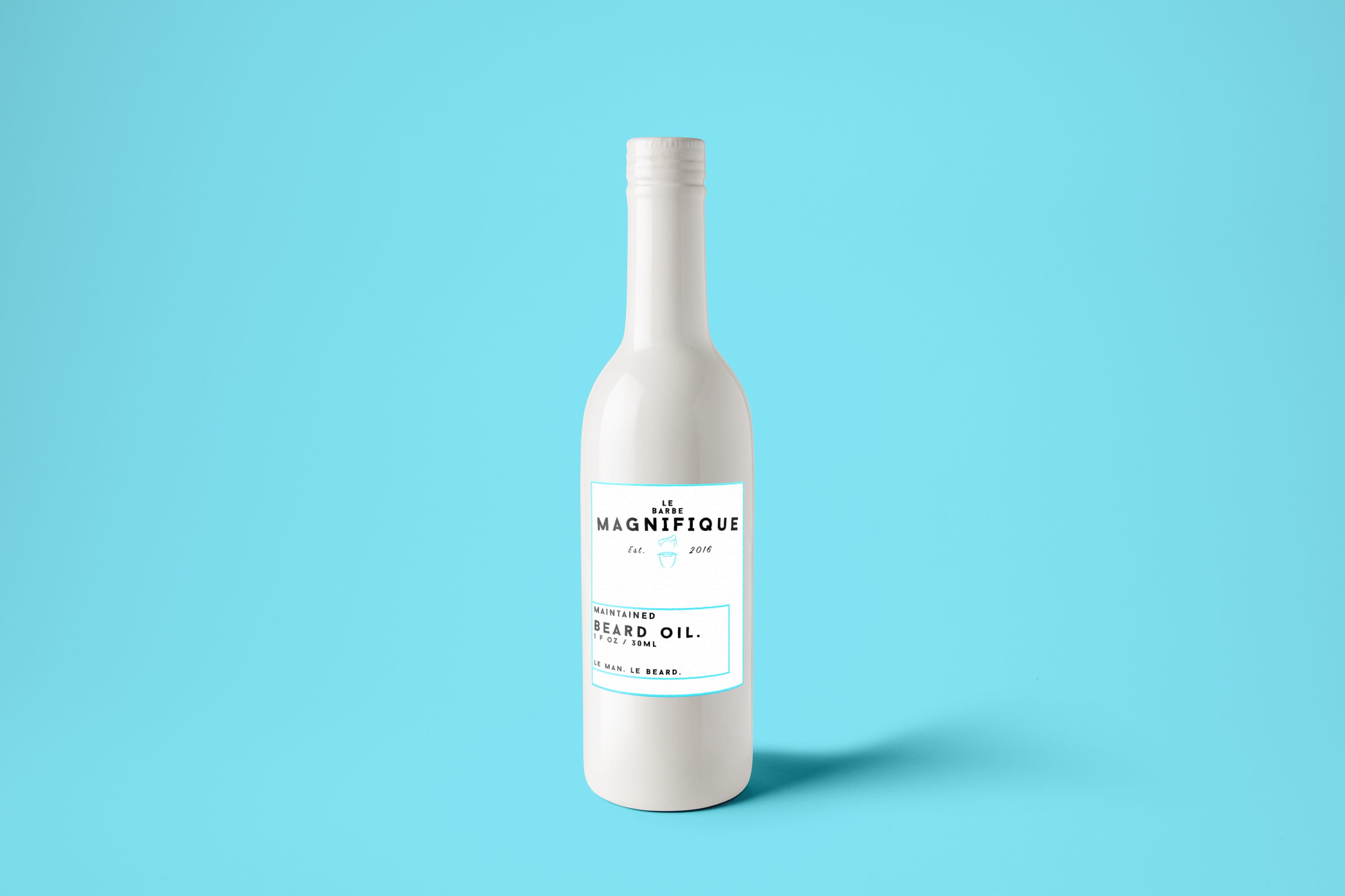
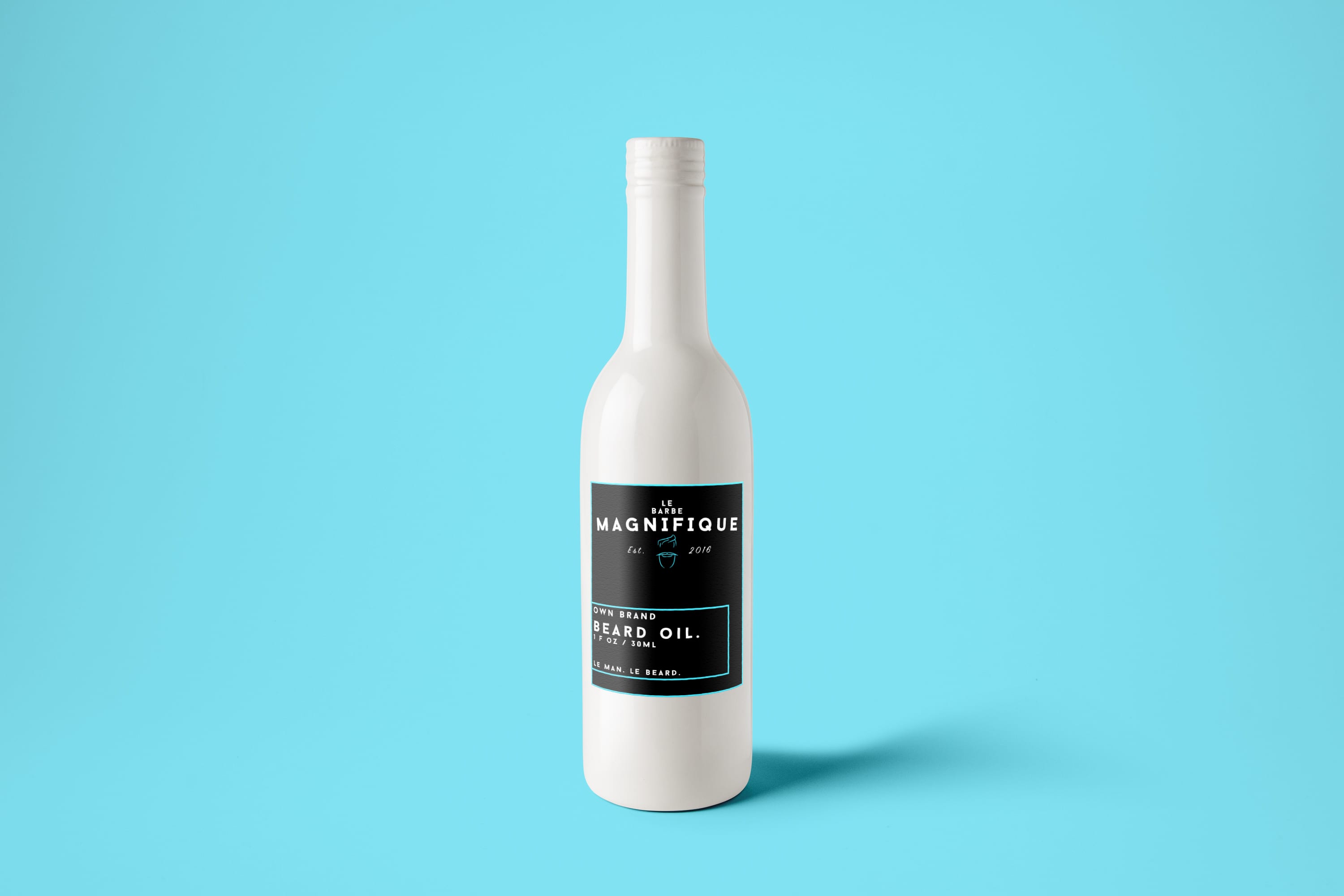
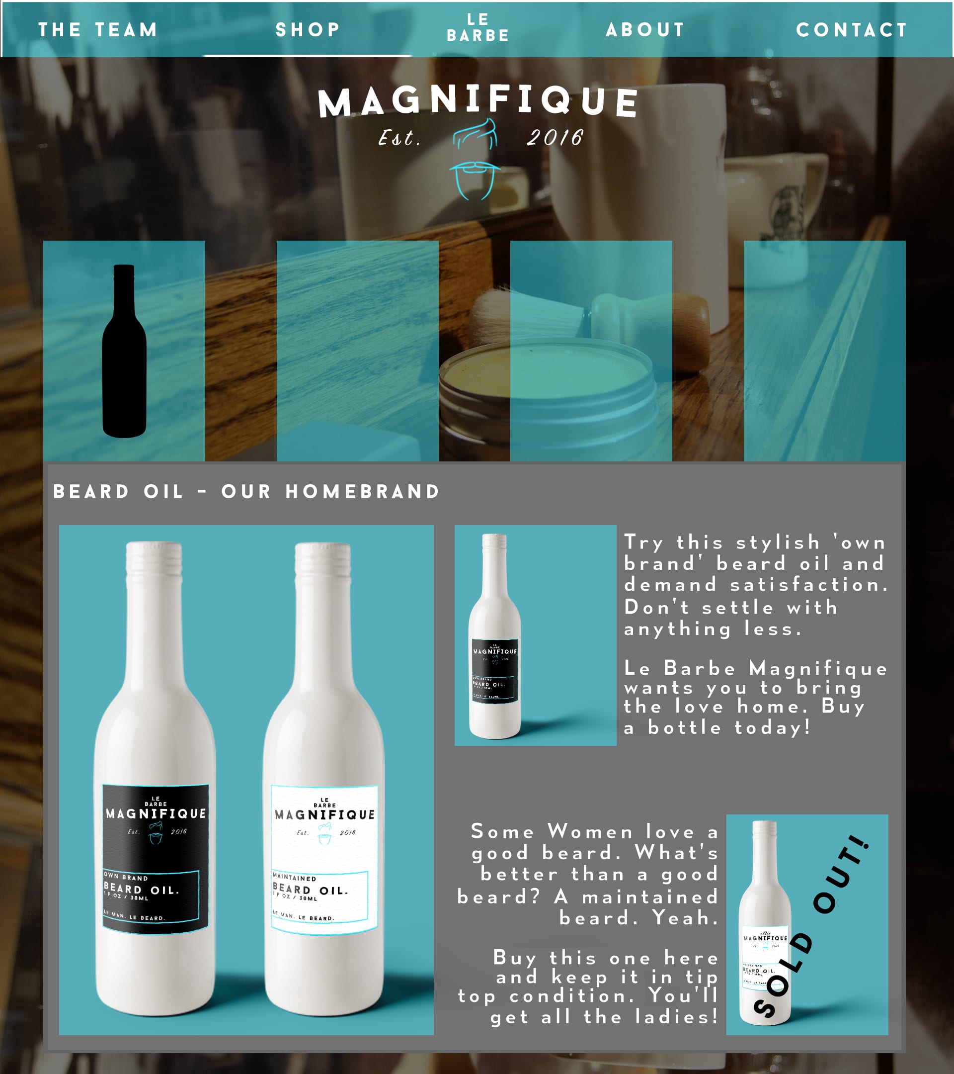
Branding Brief Evaluation:

I personally enjoyed this brief very much as I enjoy redesigning and creating new products on Photoshop and InDesign. I felt that overall, my response to the brief was met accurately as I created a unique, bold logo for the company that screamed quirkiness and professionalism. I kept to a slim colour palette and kept this consistent through the branding design. I’m very happy with the consistent look of the branding but I feel if there were any improvements to make, it would be with some of the products I created as well as maybe doing a little more research. Overall I’m happy with the look of the new brand.


Children’s Book Evaluation:

This brief to me was slightly challenging as at first I couldn’t come up with a solid storyline for a book suitable for children. At first I wanted to adapt a film into a children’s book, but this proved to be something worse than a simple challenge. I then came up with the idea of the Panda and ran with that. Towards the end of the brief I decided to change the style because I simply wasn’t happy with how the artwork looked so I changed it to a hand drawn style. Overall I feel I got my intended message across through the storyline and the composition of the book works well but I’m not very happy with the way the artwork looks, yes it looks better than before but if I had more time or if I was to do this again I’d restyle everything.

Completed Branding – Website

The website is now completely finished and up to the standards that I feel are acceptable for a business wanting to expand across the borders. Below are the final results in order in both desktop and mockup form.

Intro Page Home PageTeam Page Shop PageShop Page with Open Section Contact Page

Pg1 Pg2 Pg3 Pg4.1 Pg4 Pg5

The background images that I’ve used were acquired on Google.

I feel that, overall, the website has come out continuing that theme of a professional welcome. I’ve kept the colour palette consistent within the design and made sure to include various quirks across the website in order to keep that sense of quirkiness floating. I feel like i have successfully rebranded a company that plans to expand across the borders.

Thus brings an end to the brief.

Completed Branding – Finished Logo and Business Card

So I’ve now completed the Branding brief. I’ve created a new website, various business cards and a smashing new logo for the already classy barber shop, ‘Le Barbe Magnifique’. Below are my results.

Final Logo

Mockup 2 Mockup 1


Overall I am very happy with the outcome of the logo. I feel it’s formal, quirky and above all professional in how it appears to customers new and old. Franchising a company overseas can be difficult so acquiring the perfect logo is key as this is the door to a new branding identity. The colour palette for the logo matches that of professional standards and stays consistent across the entire design process of the company.

Current state of Branding

So here’s some images of what the website looks like at the minute. I’ve also included a mock up version of my business card designs.

Contact Page Home Page Intro Page Shop Page with Open Section Shop Page Team Page


Mockup 1 Mockup 2

Le Barbe Marchandise!

So today I’ve designed two bottle designs for Le Barbe Magnifique’s line of beard oil. I’ve named them ‘Own Brand’ and ‘Maintained’. I’ve tried to stick to a very modern, grounded style while at the same time allowing the consumer all the information needed. It’s unique, was to look at and attractive. The colour theme is consistent with that of the website and brand identity as well as maintaining the level of formality needed to run a business. Here they are below as a label and then on the bottles.

Own brand logo 1 Own brand logo 2

Beard oil 2 Beard oil 1

Shop Page with Open Section