Category: Branding (page 2 of 4)

Website Design – Almost there!

So I’ve created some mockups of what the Barber Shop website would look like. Fairly modern, it’s striking and it keeps a consistent theme that works well with the initial idea and logo style. Quirky, professional and unique. Here they are in order. The empty squares are there as placeholders.

Intro Page

Home Page

Contact Page

Shop Page

Team Page


Website Designs have Emerged!

Once again we wander back to the previous brief with ‘Le Barbe Magnifique’. So I’ve now started working on the website design for the company, therefore creating the first steps into the new world of marketing. To go with the simplistic style and classy, modern look of the logo, I decided to try and replicate this with the design of the website.

Intro Page 

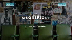
The first image is the intro page, the page users are greeted with upon visiting the site. It’s an intriguing vision, having nearly nothing on it but at the same time giving you the exact amount of information needed. We have two options, a ‘Main Site’ and ‘Book Now’ button, both of which would link to other pages of the website. The colours of the page are similar to that of the logo, therefore keeping a steady consistency for which customers would become used to upon further use. The image in the background is designed to give the website and business a vintage feel while also making you feel welcome with the row of seats at the bottom.

Home Page

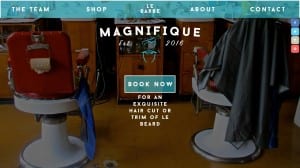
The second image is that of the ‘Main Site’. This has all the main features on, allowing the user to find out more about the business, shop for their own razors and other shaving goods or book an appointment with the firm. The words underneath the ‘Book Now’ button are designed to carry on this sense of good humour, yet again giving this business a unique look to it. The background picture is also a set of chairs, once again delivering that welcoming feeling that is so important towards a new business. The colour screen has continued the consistency that is just as important to a serious, confident business.

As I progress with new pages I’ll update.

Logo Ideas

Had a few new logo ideas. Decided to take a more serious approach to the style, etc… I realise now that I’m drastically distancing from my original plan.

Revised Logo 1

Business Card 1


Brochure 1

Font Test!

So I feel like I’ve decided on a simple look for the logo (I’ll look into this in a later post) so what’s next is to decide on the perfect font style. I created a set of 12 designs each with the same logo but different type. The images below feature the ones I decided on (circled in red) as well as the other tests.

Font Test 1.1Font Types below:

1 – Dry Brush

2 – Master of Break

3 – Amsterdrum Grostek

4 – Fuga de Cerebros

5 – Awesome as F**k

6 – Stackyard

Of these font types I decided to go with the first and fifth. To me they seemed more professional yet they matched the style of the brand, quirky, unique and fresh. The other types seemed ‘comic-y’ and distracting as well as being fairly hard to read. I want a certain amount of formality with the font as well as having it being easy to read and quirky.

Font Test 2.1Font Types below:

1 – ArtBrush

2 – The Citizens

3 – Guld Script

4 – Olympic Branding

5 – Ventography

6 – Bruss

With these, I picked the first and sixth font. Once again I picked them due to their professional and formal stance. The others, like the page before, seemed too childish and they reminded me of comic sans (which is a no go) as well as being too distracting. The two that I’ve selected make the logo look more attractive and formal towards customers. Below I’ve created some test logos with two of the fonts just to see how it looks. Personally I prefer the second one due to the quirkiness and the formal feel that it gives off. To me, the font speaks a sense of formality and makes the barber shop look like they know what they are doing.

Logo Design 2 Logo Design


Furthermore with the Beard Logo!

So I decided to try and see what the logo would look like as a label. I drew the swirls that you see on the picture. To be honest it’s a bit crap. But alas it’s given me new ideas!

Label idea