Category: Infographics (page 1 of 2)

Final App design

Here is my final design for the app version of the infographic. I’m extremely pleased with how this has turned out and despite there being a fair amount of changes the overall style and theme remains the same. For me the part that stands out the most across the project is the colour palette due to how well each colour works together.

Page 1 Page 2Page 2Page 3 Page 4Page 2Page 5Page 2Page 2


I’m pleased with the overall design of all the pieces because it gets across the style of simplicity. My target audience was people with a similar age range to me as it’s something that I would want to use and judging by that result then I feel the target audience aim has been achieved. The use of the colour palette works well on the app as it adds to overall idea behind the flat design and it makes the app look professional. Below are some mockups of the finished app design.

Page 1 Page 2Page 3 Page 4Page 5

Poster and Website

I’m including these together because they are very similar.

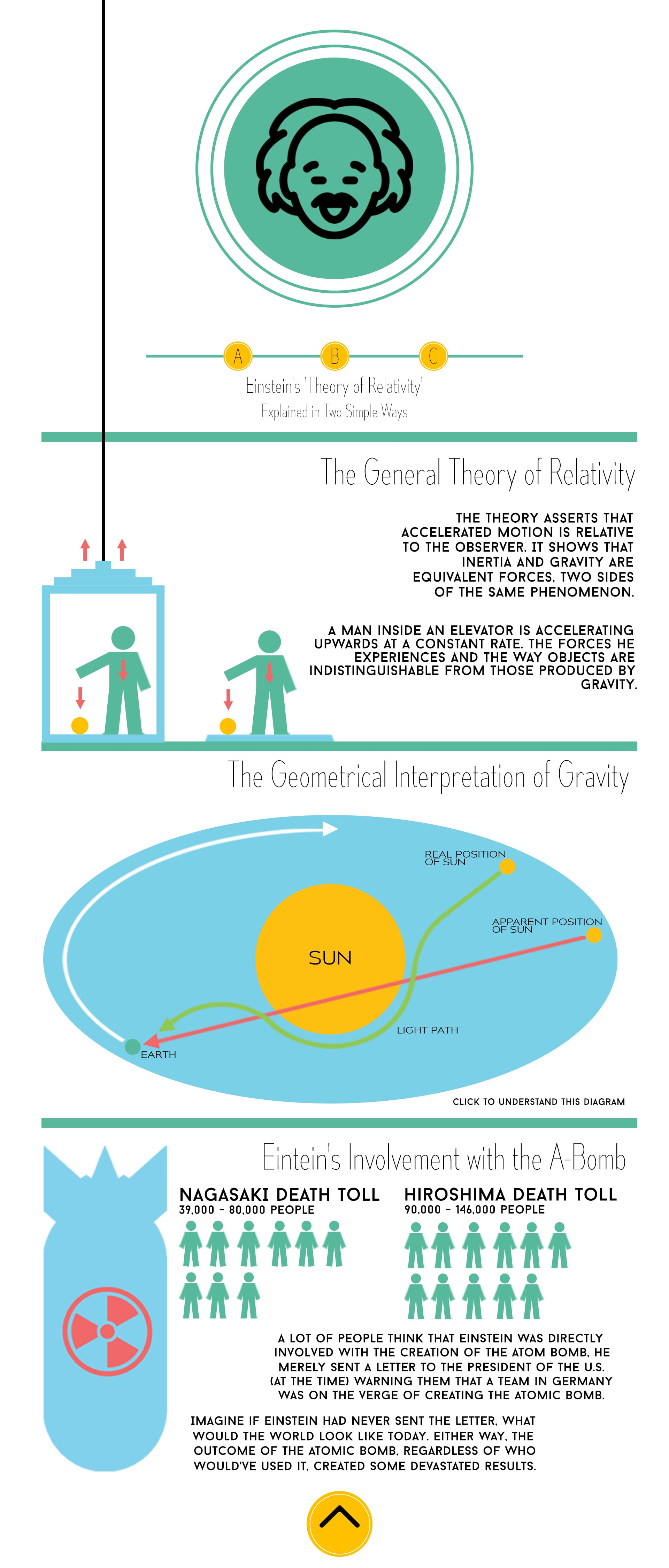
The website features a single scrolling interface with buttons at the top and bottom which allows the user to go through pieces individually if they wish to do so. Below is a look at the entire website (without mockups).

Website(Website without overleaf) Website (Overleaf) 
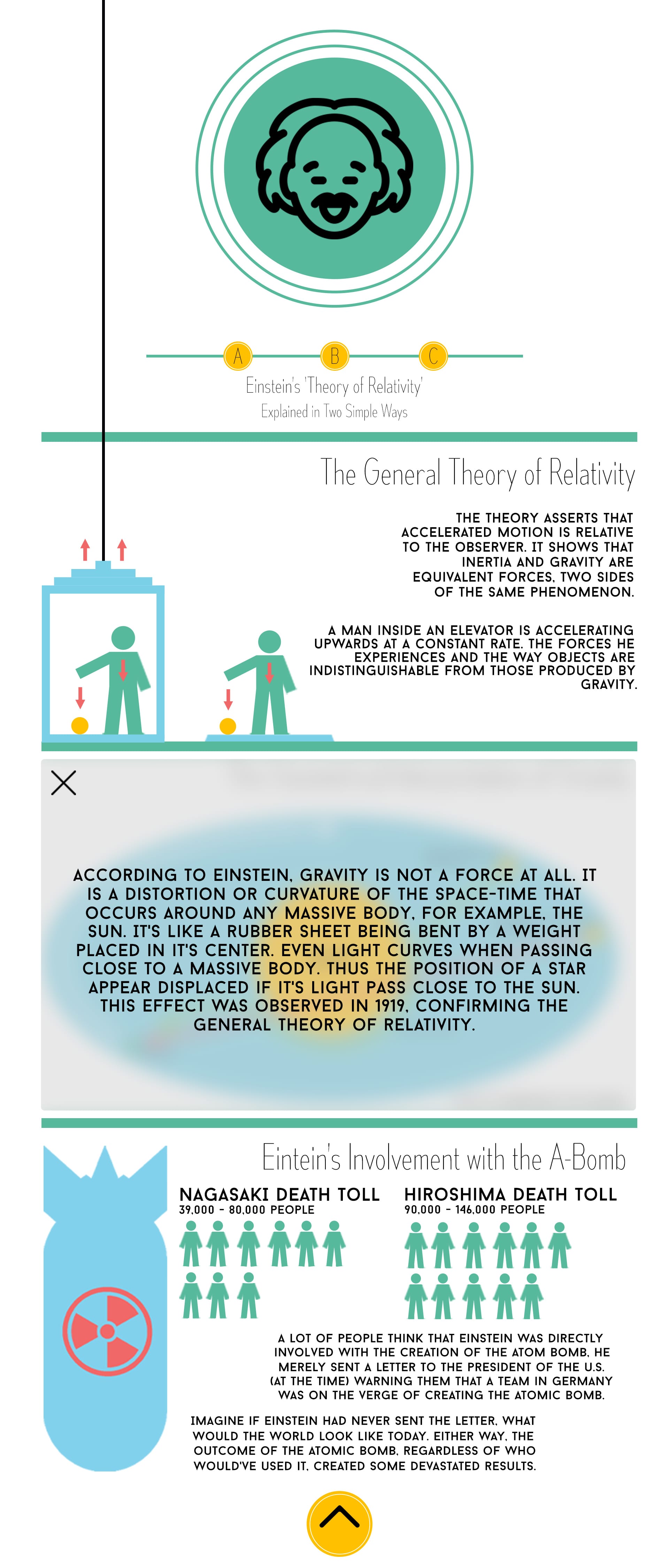
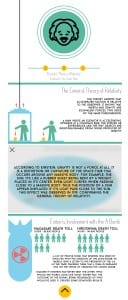
(Website with overleaf)

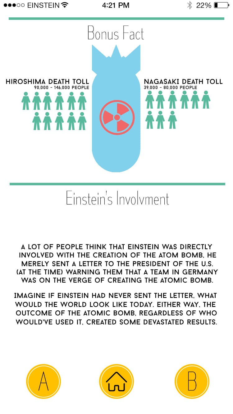
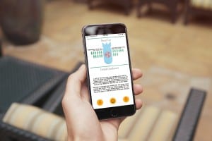
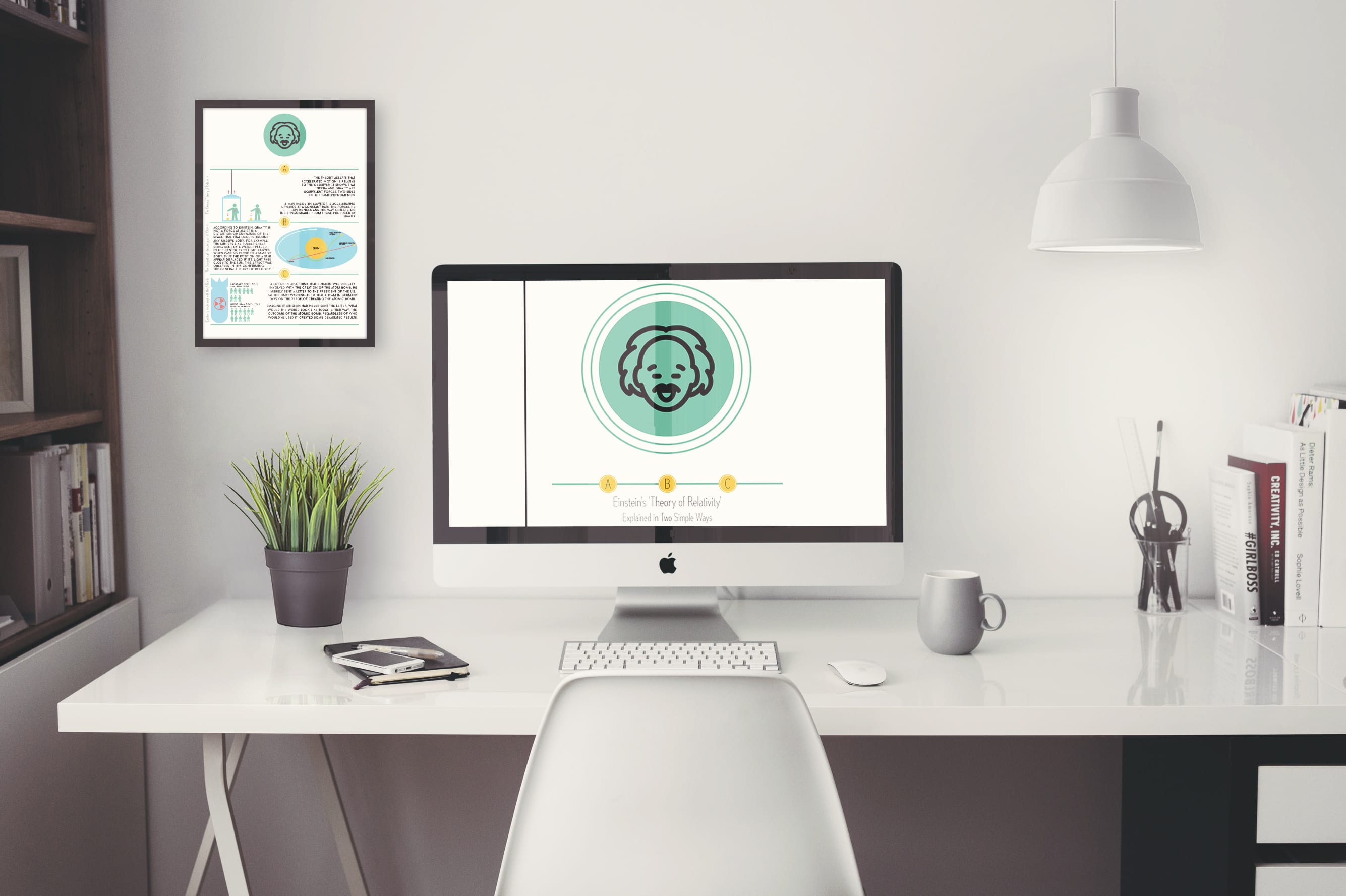
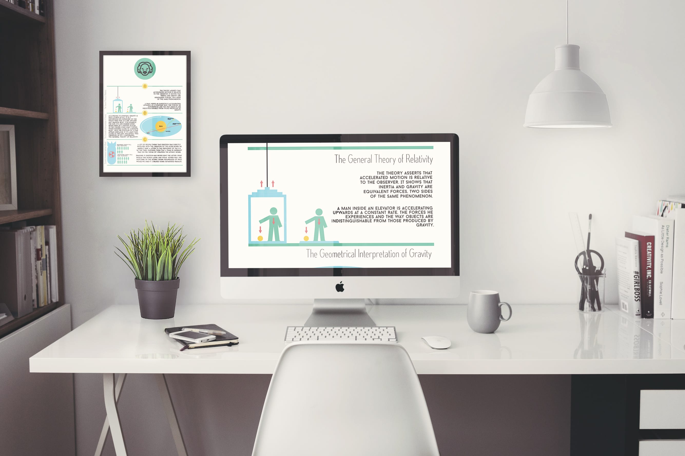
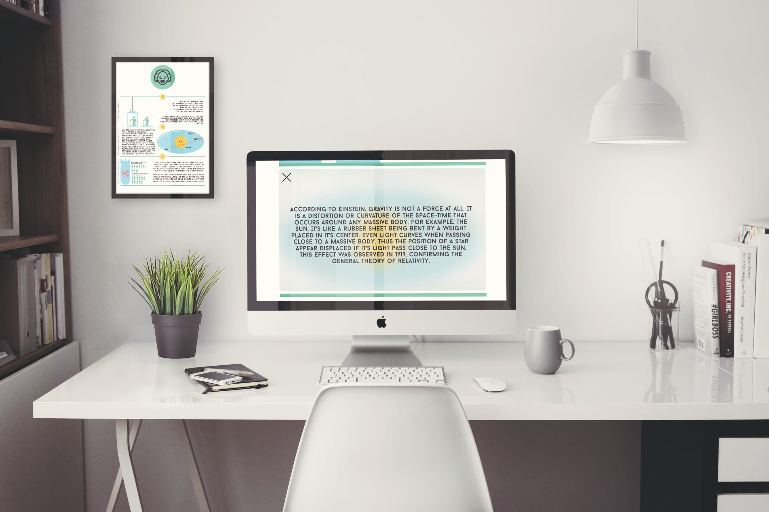
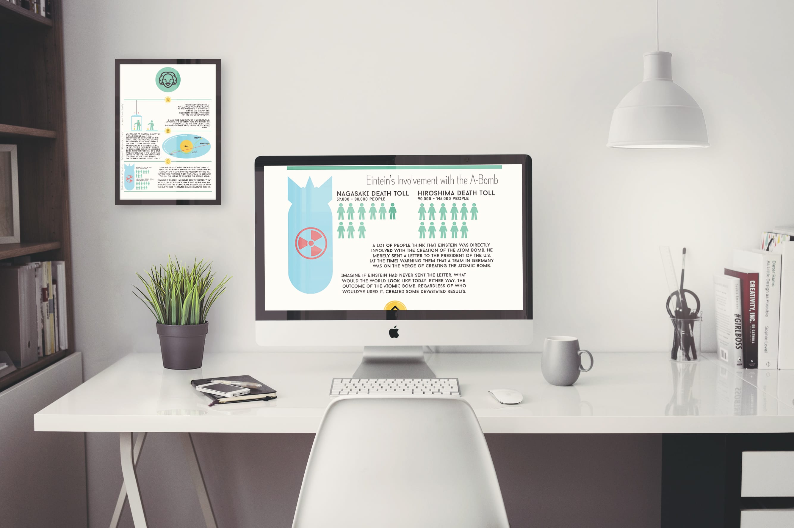
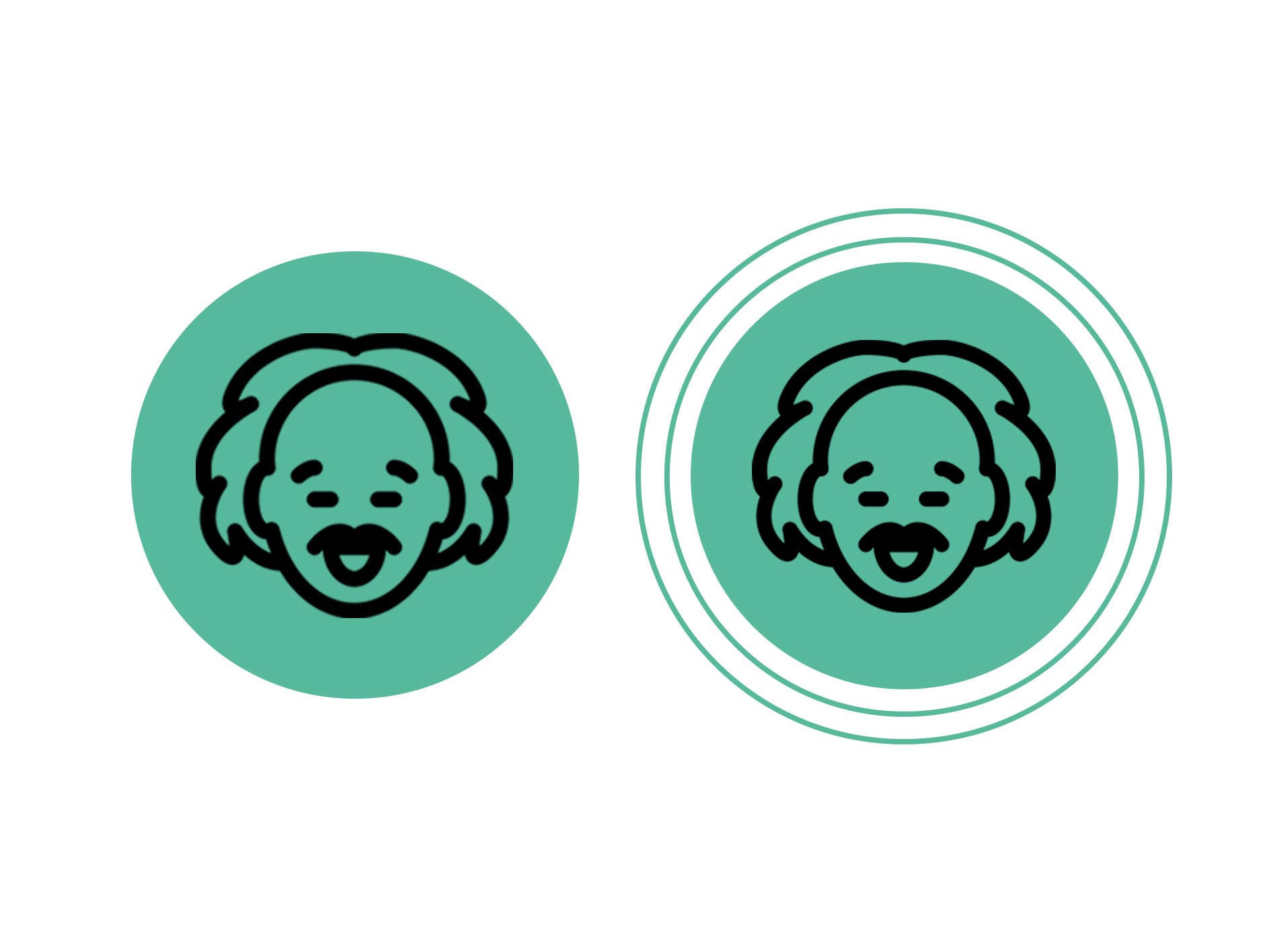
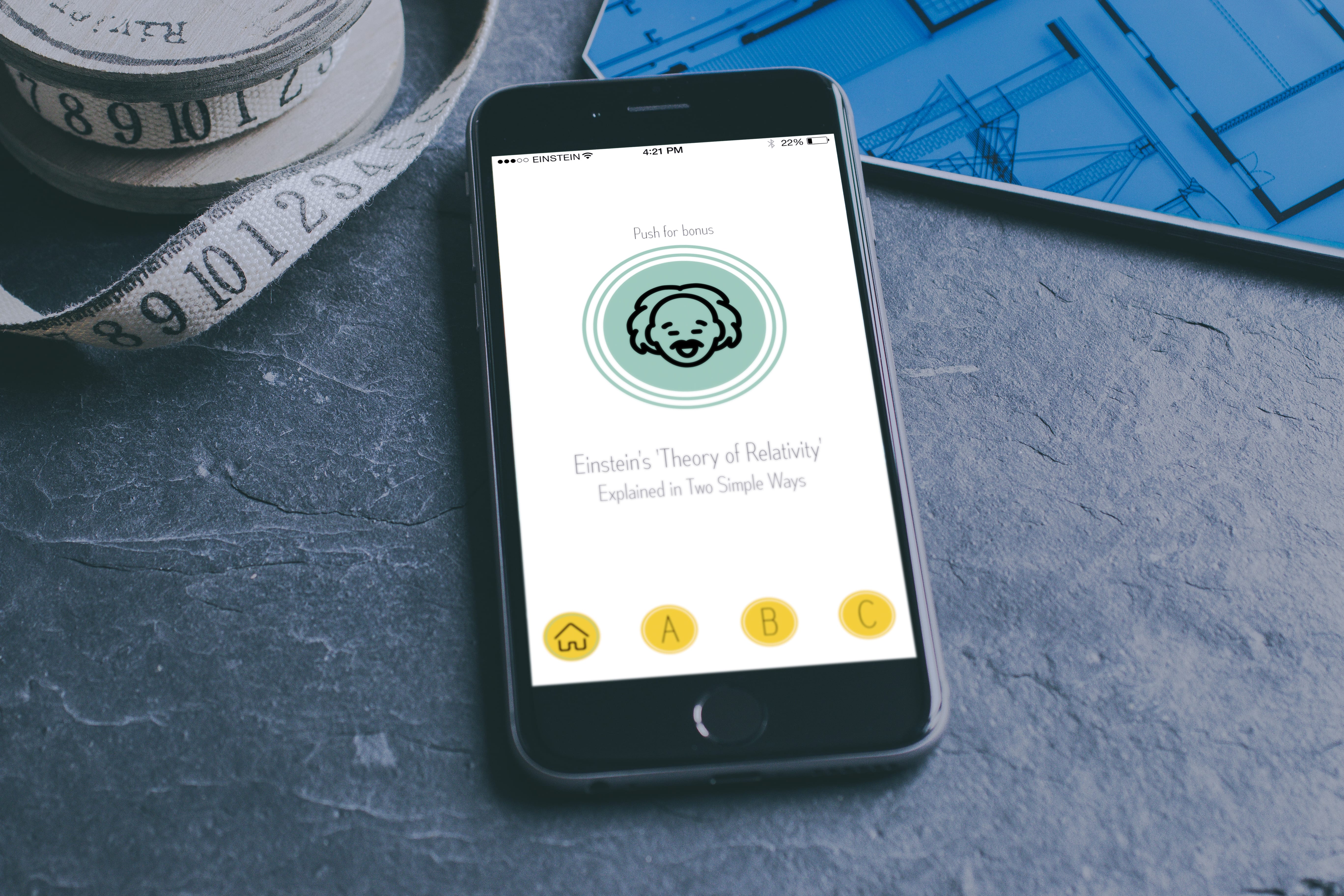
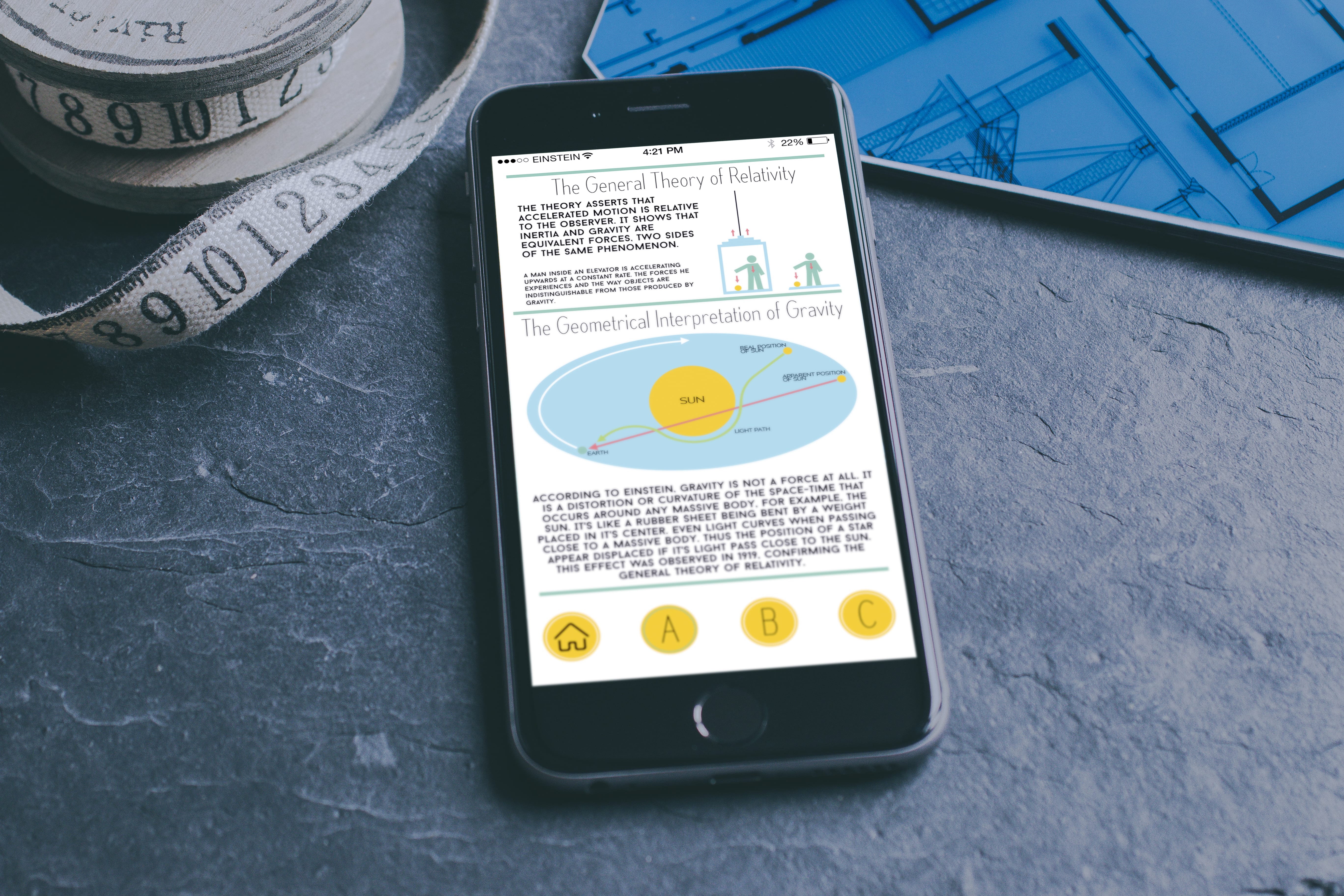
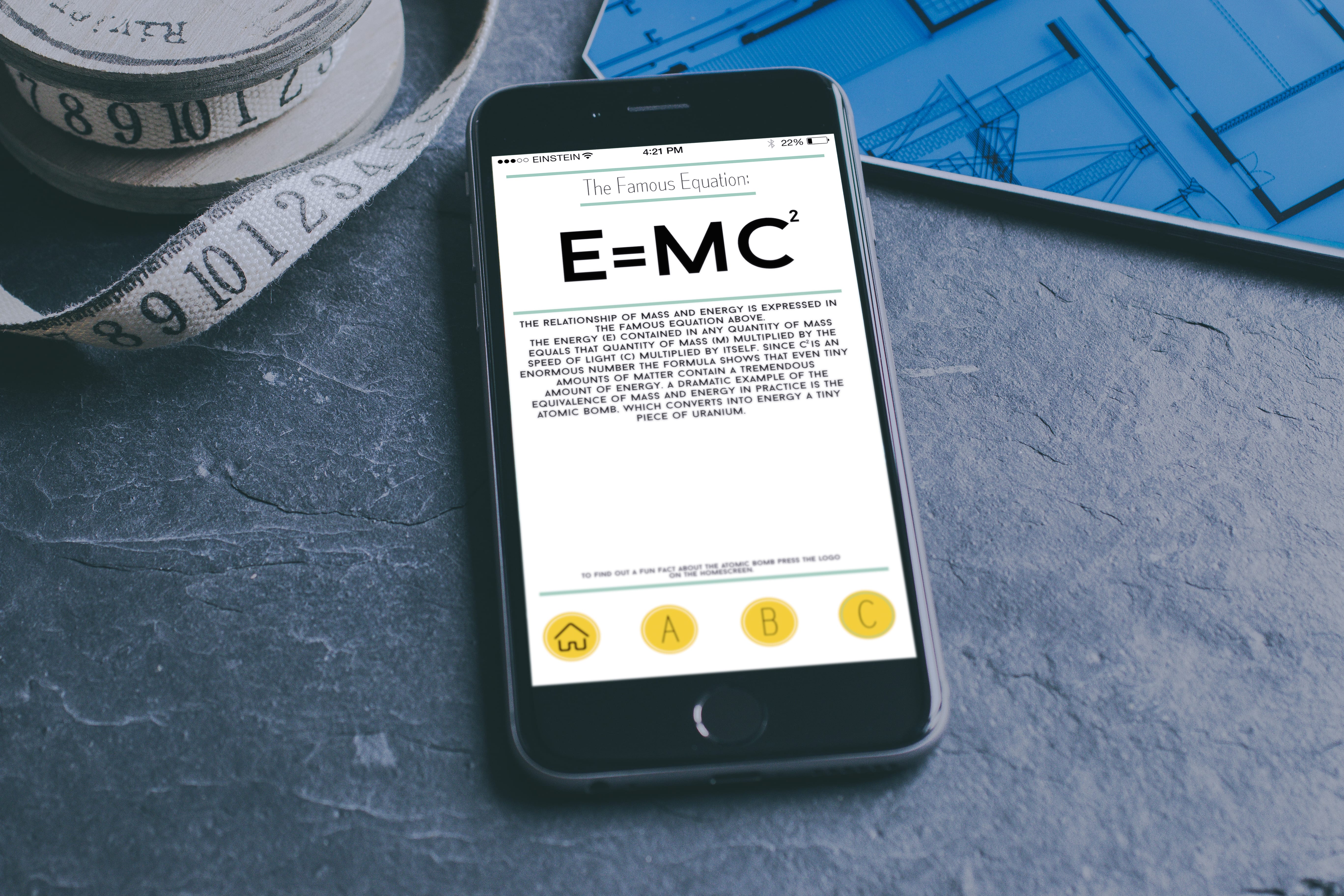
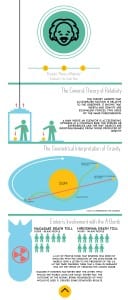
I’ve used the interactive logo which allows the user to work out that this infographic is interactive. The three icons below the logo react with each fact and if you press one it will scroll down to the corresponding fact. On the second website it features an overleaf on the second fact and this is there so that more information was made available. I used the Gaussian blur tool which gave the background an interesting, visually pleasing look while at the same time allowing the information to be easy to read. I’ve featured the same colour palette on the website as I have with the app allowing a sense of continuity to be carried across each media form. Below are some mockups (with the poster in the background).

Page 1 Page 2 Page 3 Page 3 (Overleaf)  Page 4


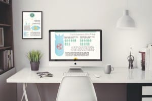
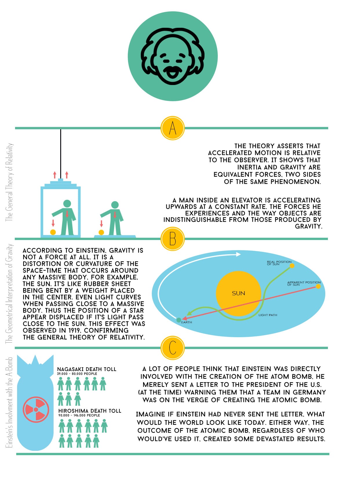
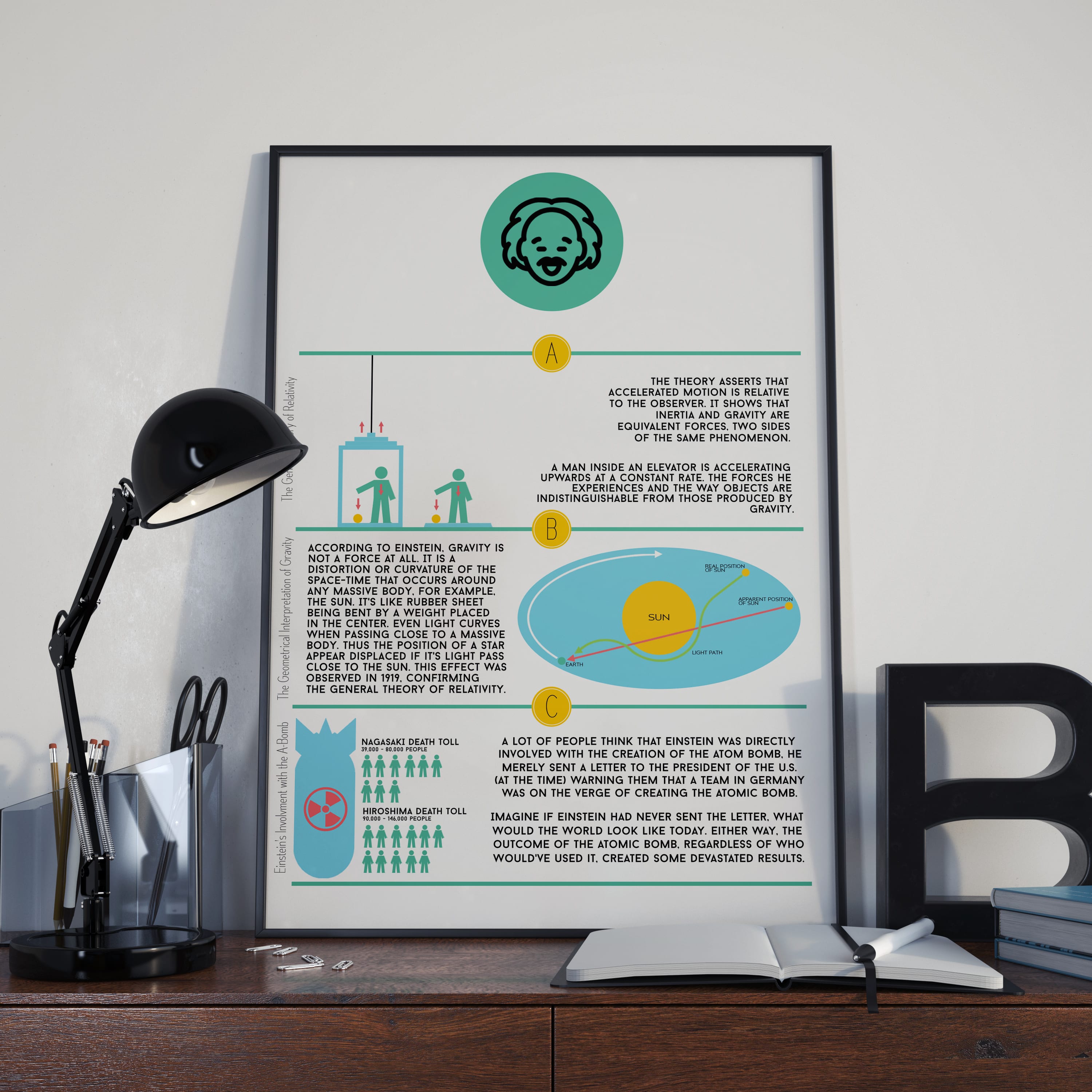
Now I’ll talk about the poster design of which you can see within the mockup above. I’m proud of this because I like compact design where everything that needs to be there is there, allowing only the appropriate information to be presented.

Poster Mockup


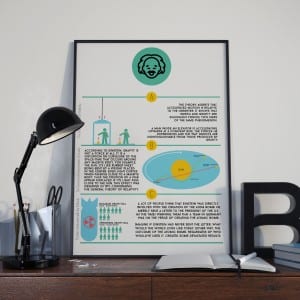
With this design I’ve featured the logo that represents the physical form of information, meaning that the piece isn’t interactive. As with the website and the phone app, I’ve carried across the colour palette and continued a consistent sense of simple design across all platforms. I’m happy with all the designs (with the unfinished app as well) as I’m happy with the consistent design features that have been brought over across all of the pieces.

Einstein Logo

So I want to take a minute and look at the logo design that I’ve created for my Einstein infographic. I wanted it to carry across the same fell as the initial app design which was to make a simple, easy to understand design. Here it is.

Logos

I wanted the logos to feature the core colour from my chosen colour palette and made sure that the ice of Einstein was as simple as the rest of the designs. I’ve designed to version of the logo with the first being a single circle and face logo which implies that the document is a physical thing and that you can’t interact with it (the poster) and the second one indicated that the document was an interactive piece which allowed you to touch or scroll throughout the information (Website and Phone app). I’m very happy with how the logo(s) turned out.

App Design

So I’ve been working on my phone app for a while and below are some mockups demonstrating the look of the app. These are examples of the first drafts. Looking at them there are problems in which I explore below.

Page 1 Page 2 Page 4 Page 5

Upon looking at the final version on a mockup it’s clear to see that there are still some problems. For example, the text above the icons on some pages proves to be too small as well as the amount of white space left throughout the pages. When I work on the next draft I’m going to focus on making some text larger or moving some images onto separate pages to create a sense of space. I feel that the colour palette is working well, making it nice to look at and focus on. Surprisingly yellow, green and blue work well together. Overall I’m pleased with the look that has come across from the sketches and I’m pleased with the look of the logo on the phone.

I’ll keep working!

Design Ideas

So below I’ve been sketching out some ideas on how I want the phone app, poster and website to look for my infographic. They all carry the same style throughout with different plans for each. For the app I want it to be a very visual piece, something that has a good mix of images and information which in turn makes it easy to understand. With the poster and website I want this theme to carry along but with slight alterations mainly on the website. With this I want it to be a single scrolling piece but with the addition of icons at the top and bottom which allow you to cycle through the info if you so wish.
Below are all the sketches.

Poster design Website designApp design

I’ve also had some ideas for the look of a cartoon Einstein. It’s only an idea as I might not use it at all.

Einstein

Of all of these sketches (including the interface designs) I want them to have a specific colour palette as I’ve noticed thought flat design websites that there is a consistent feature when it comes to the colours. With my designs I have an idea to make the colours green and yellow. Depending on the shades this can look interesting.