So I want to take a minute and look at the logo design that I’ve created for my Einstein infographic. I wanted it to carry across the same fell as the initial app design which was to make a simple, easy to understand design. Here it is.
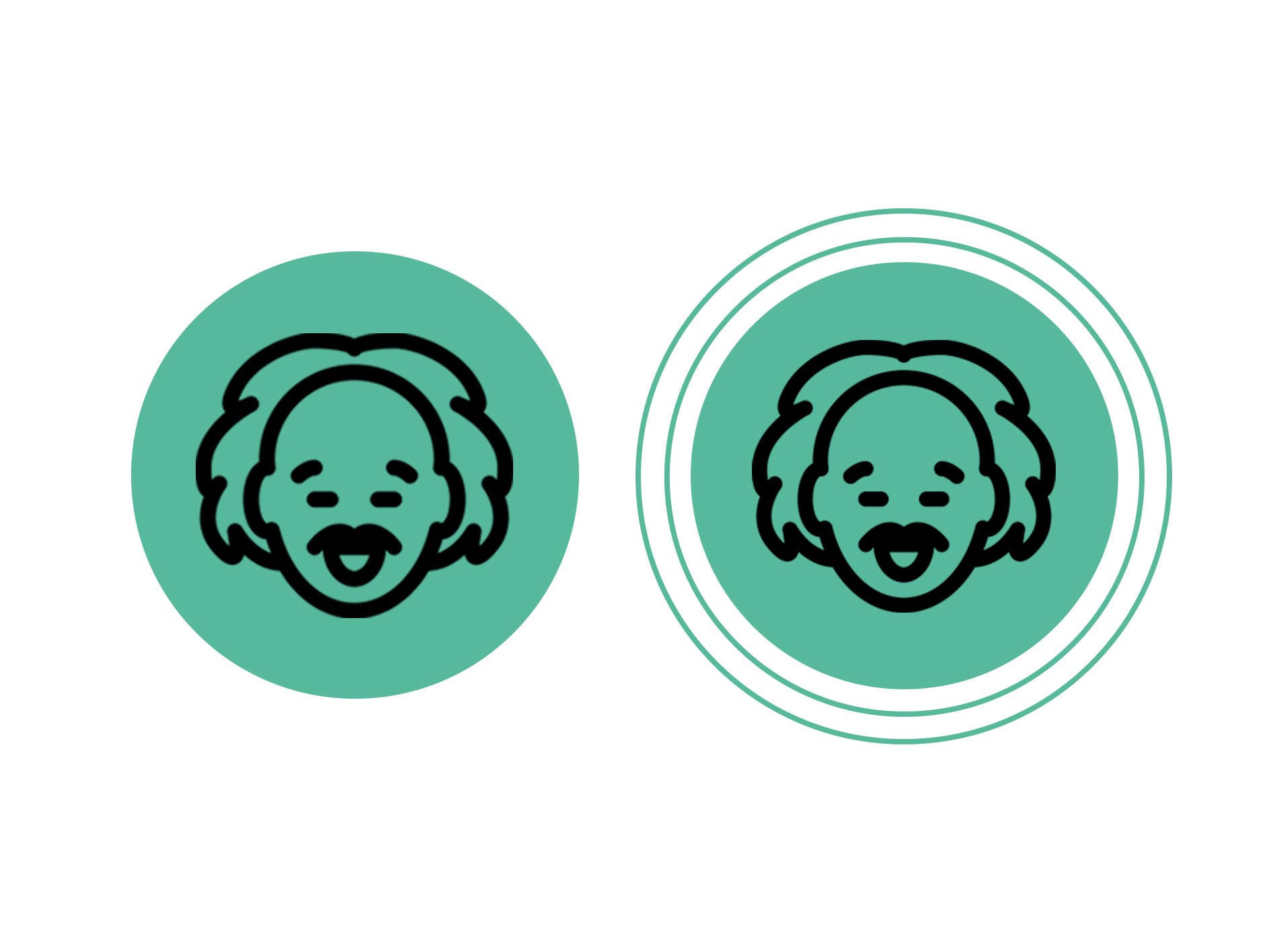
I wanted the logos to feature the core colour from my chosen colour palette and made sure that the ice of Einstein was as simple as the rest of the designs. I’ve designed to version of the logo with the first being a single circle and face logo which implies that the document is a physical thing and that you can’t interact with it (the poster) and the second one indicated that the document was an interactive piece which allowed you to touch or scroll throughout the information (Website and Phone app). I’m very happy with how the logo(s) turned out.
Comments are closed.