So I’ve been working on my phone app for a while and below are some mockups demonstrating the look of the app. These are examples of the first drafts. Looking at them there are problems in which I explore below.
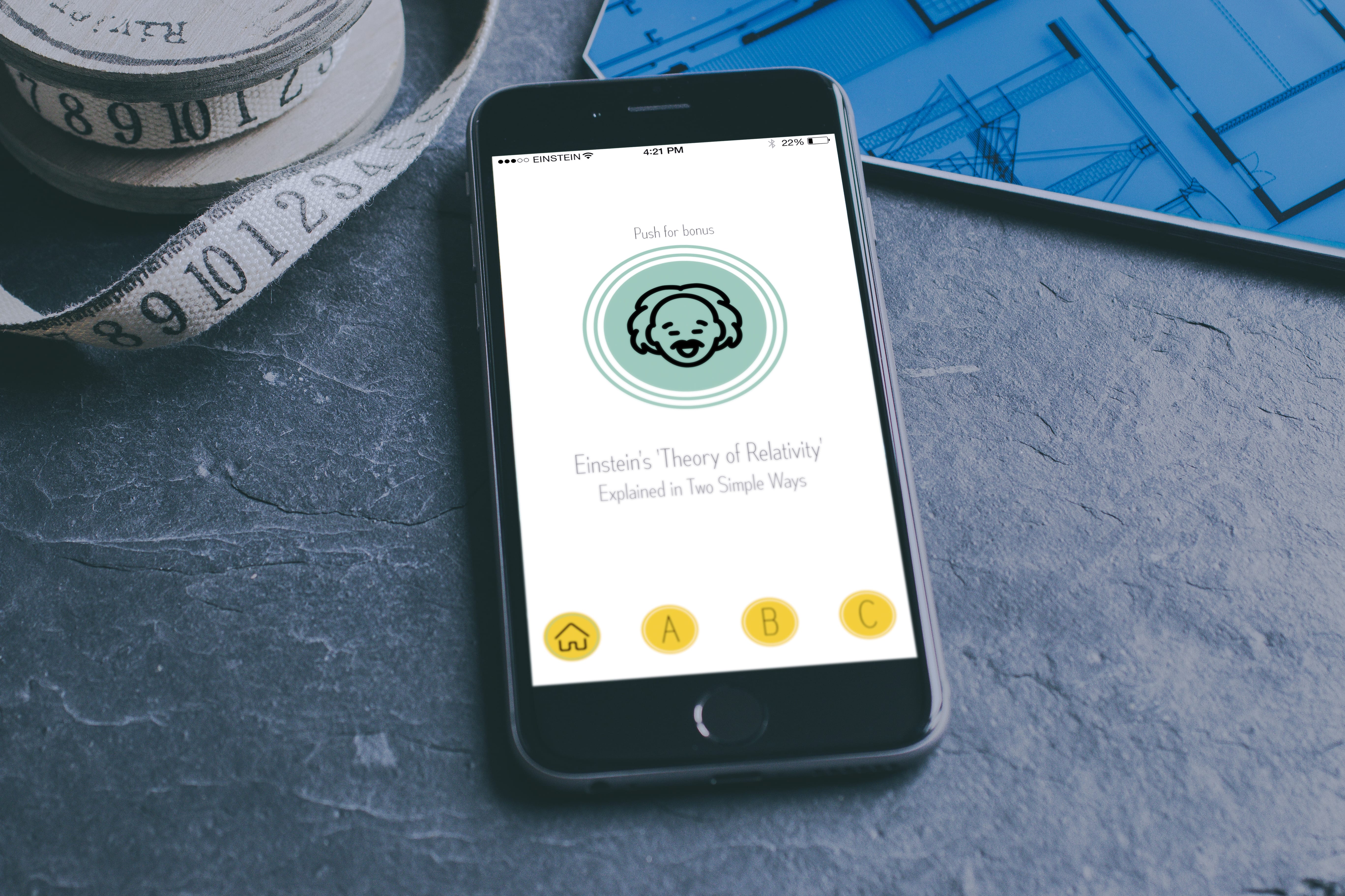
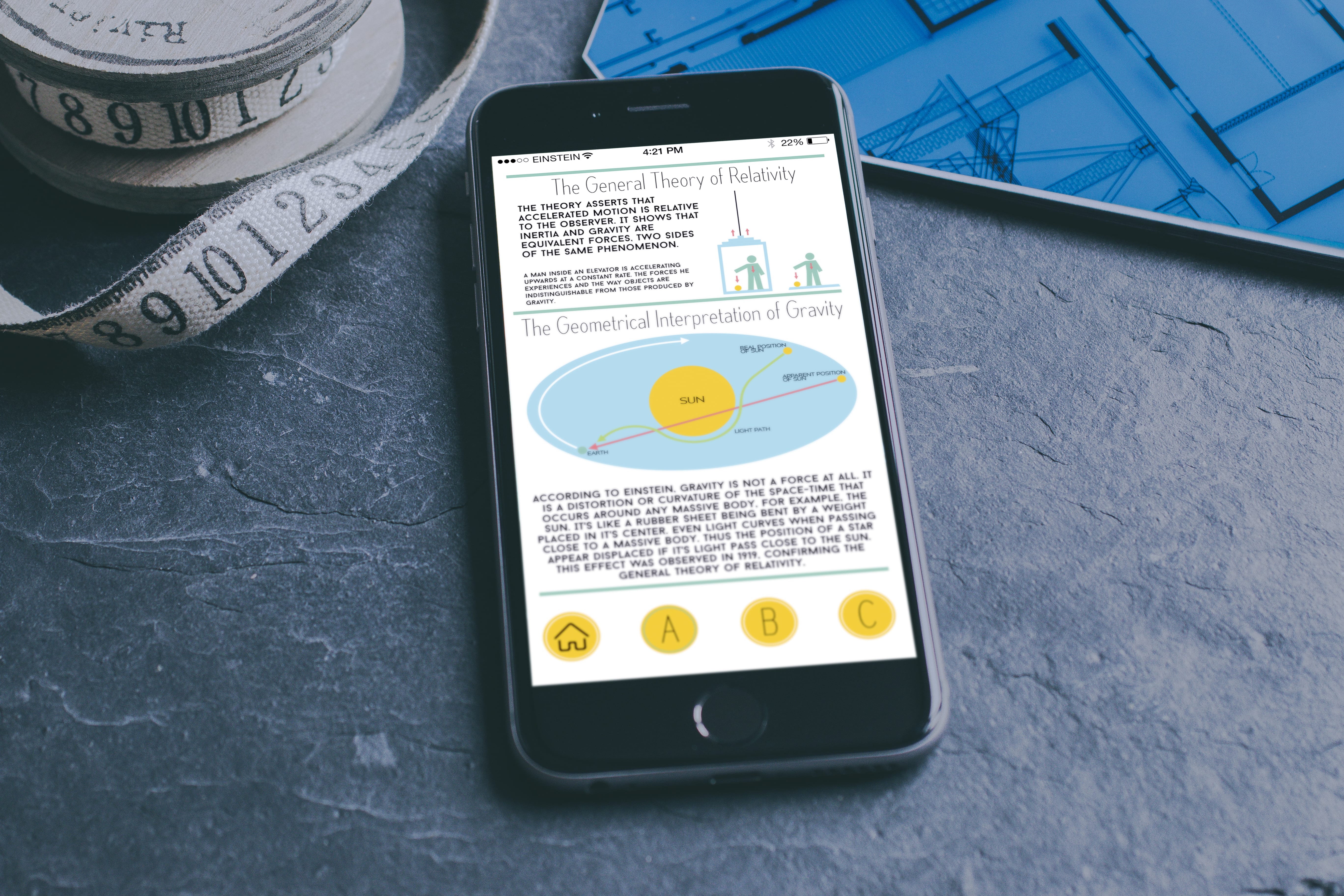
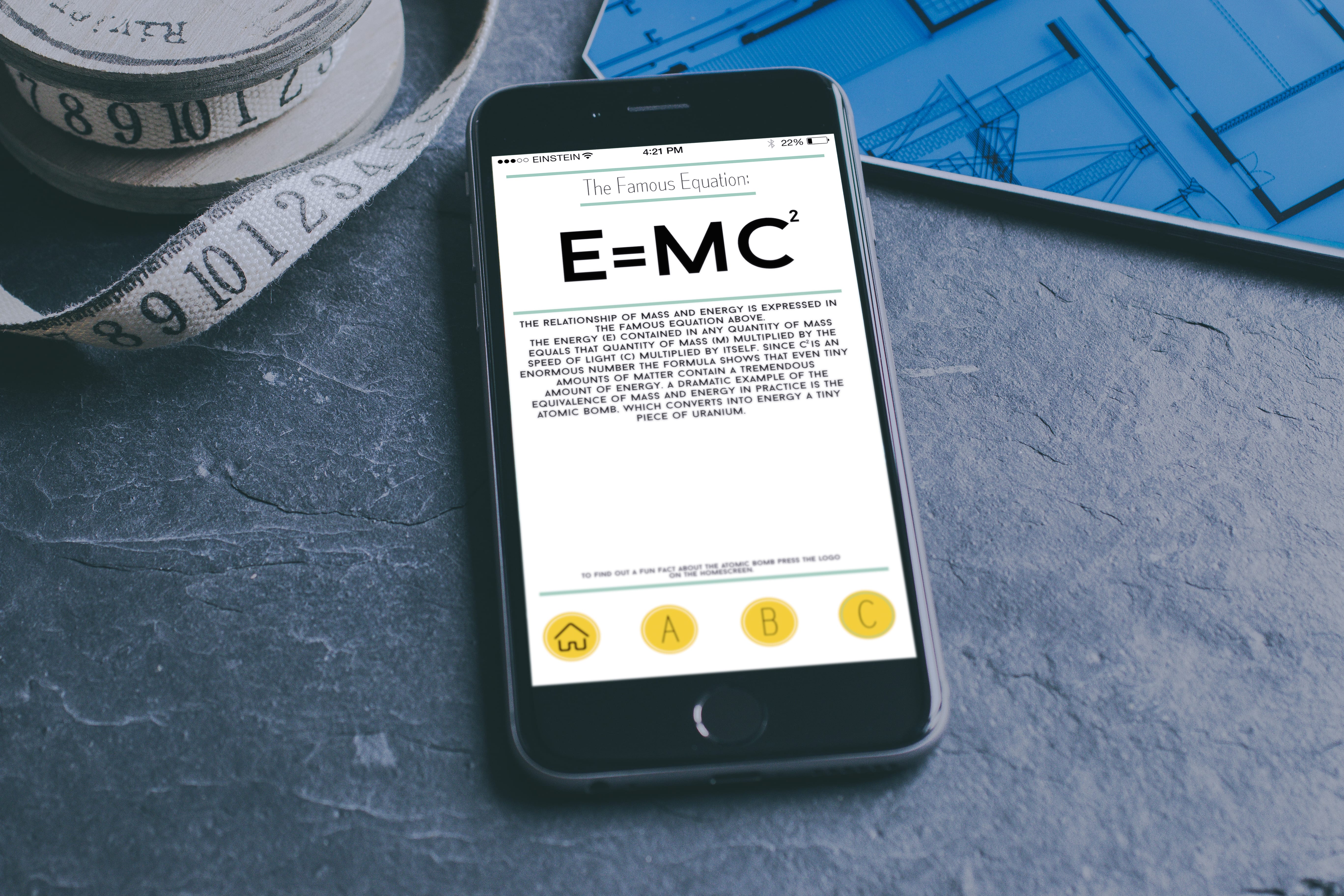

Upon looking at the final version on a mockup it’s clear to see that there are still some problems. For example, the text above the icons on some pages proves to be too small as well as the amount of white space left throughout the pages. When I work on the next draft I’m going to focus on making some text larger or moving some images onto separate pages to create a sense of space. I feel that the colour palette is working well, making it nice to look at and focus on. Surprisingly yellow, green and blue work well together. Overall I’m pleased with the look that has come across from the sketches and I’m pleased with the look of the logo on the phone.
I’ll keep working!