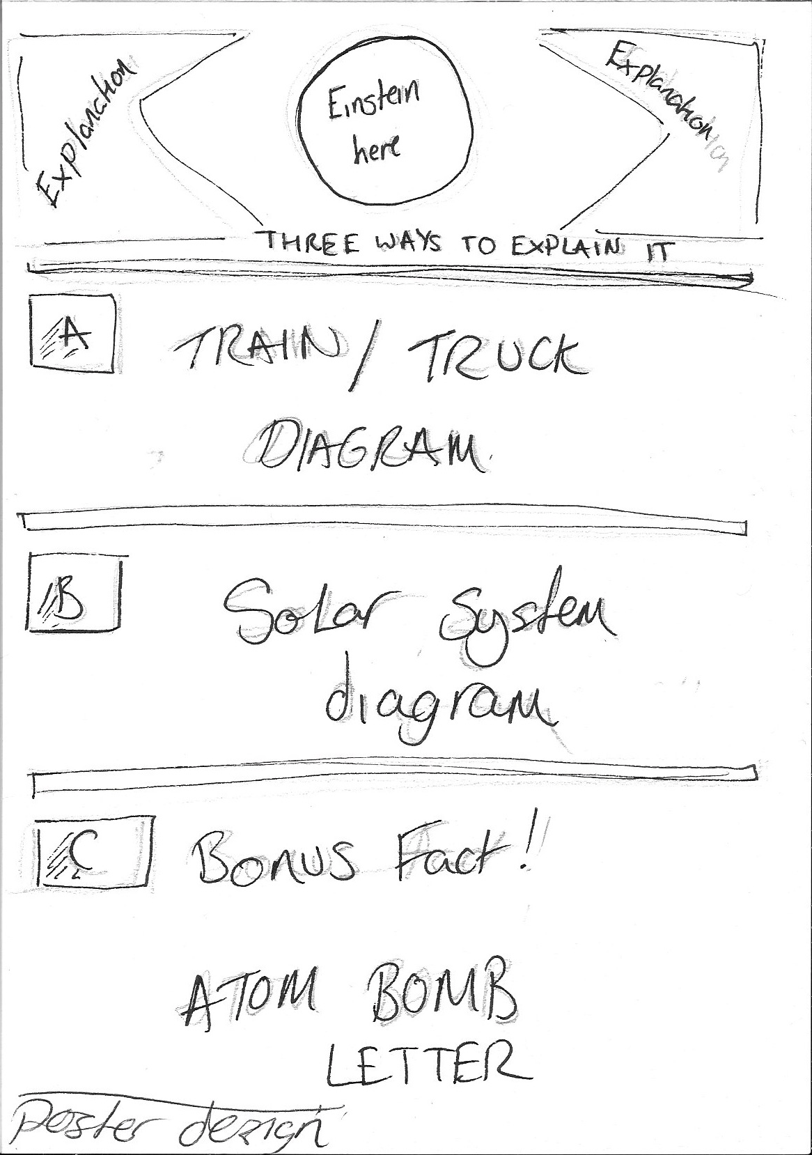
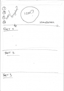
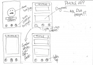
So below I’ve been sketching out some ideas on how I want the phone app, poster and website to look for my infographic. They all carry the same style throughout with different plans for each. For the app I want it to be a very visual piece, something that has a good mix of images and information which in turn makes it easy to understand. With the poster and website I want this theme to carry along but with slight alterations mainly on the website. With this I want it to be a single scrolling piece but with the addition of icons at the top and bottom which allow you to cycle through the info if you so wish.
Below are all the sketches.
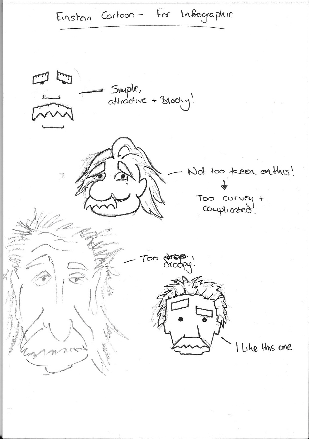
I’ve also had some ideas for the look of a cartoon Einstein. It’s only an idea as I might not use it at all.
Of all of these sketches (including the interface designs) I want them to have a specific colour palette as I’ve noticed thought flat design websites that there is a consistent feature when it comes to the colours. With my designs I have an idea to make the colours green and yellow. Depending on the shades this can look interesting.
Comments are closed.