Category: Typography (page 1 of 3)

Final Piece – Typography

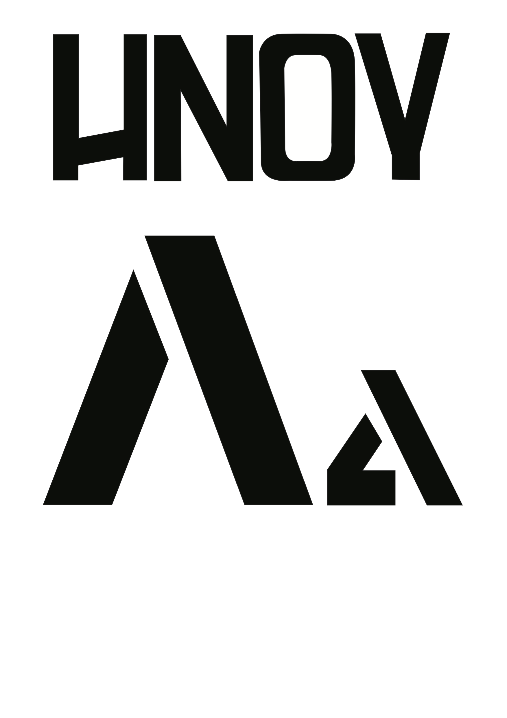
I call this one Slant Edge.

With the initial brief I wanted to create something that relates to new technologies, something that is bold and simple yet easy to look at. After hundreds of different ideas I finally filed it down to one finished piece that I feel successfully portrayed my initial idea.

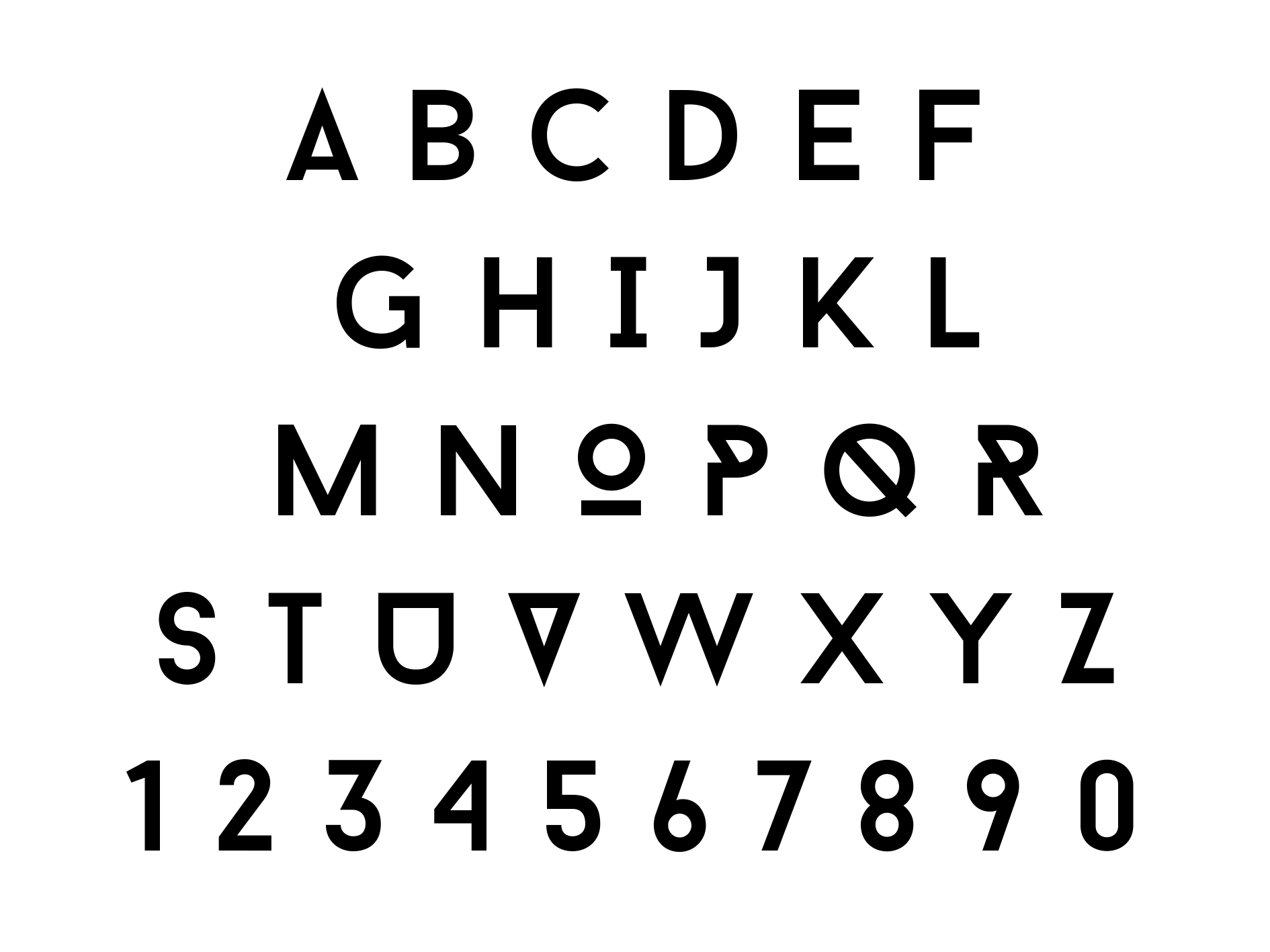
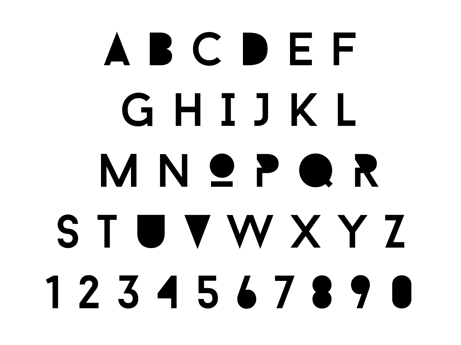
Within this document I have the sketches, the six letters and a mockup representing the type within my chosen area. I’ll be talking about each as I go along.

ABCDEF small         Final Letters


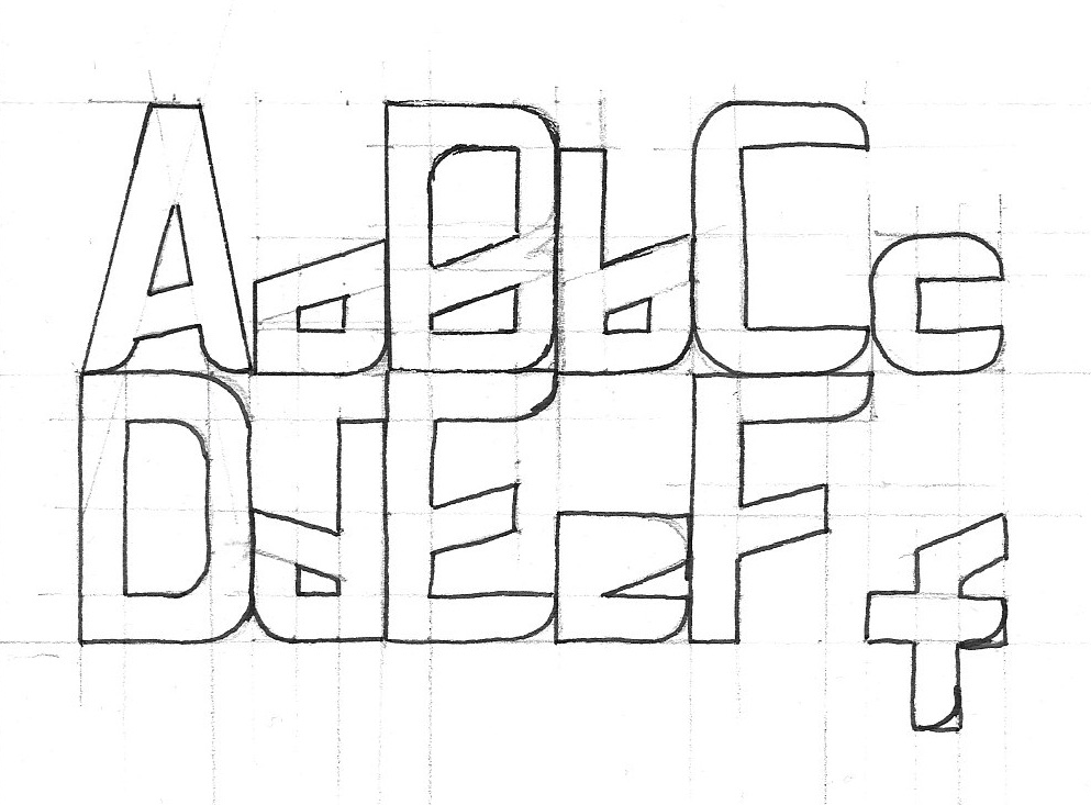
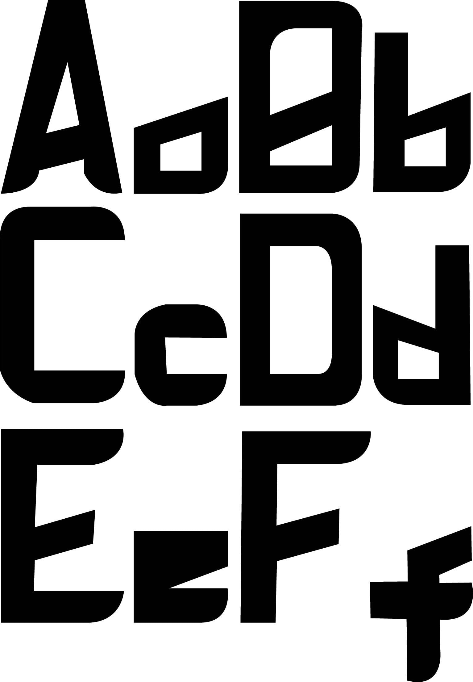
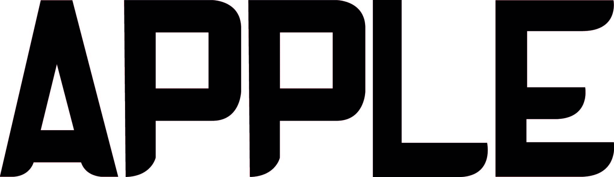
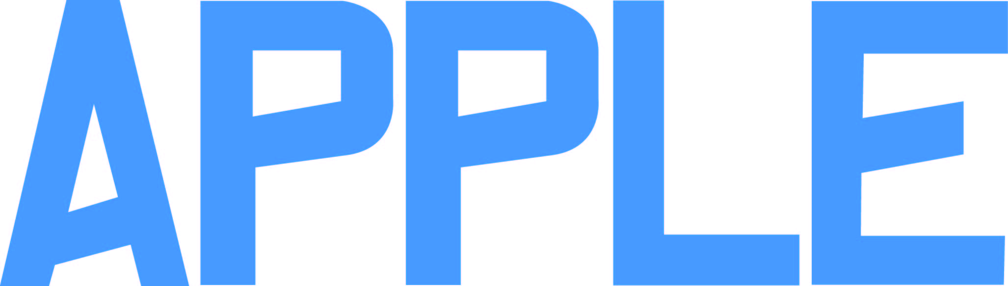
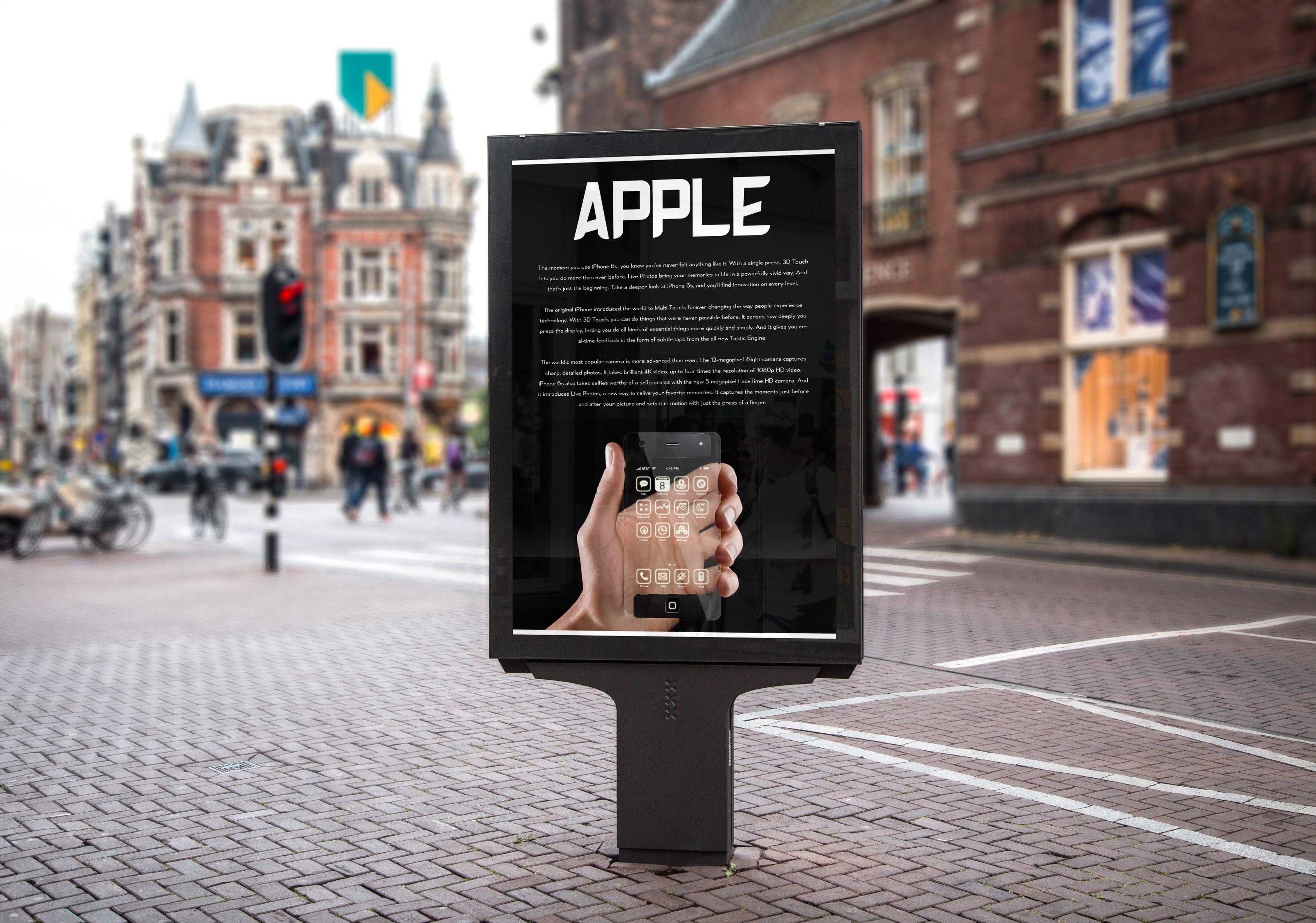
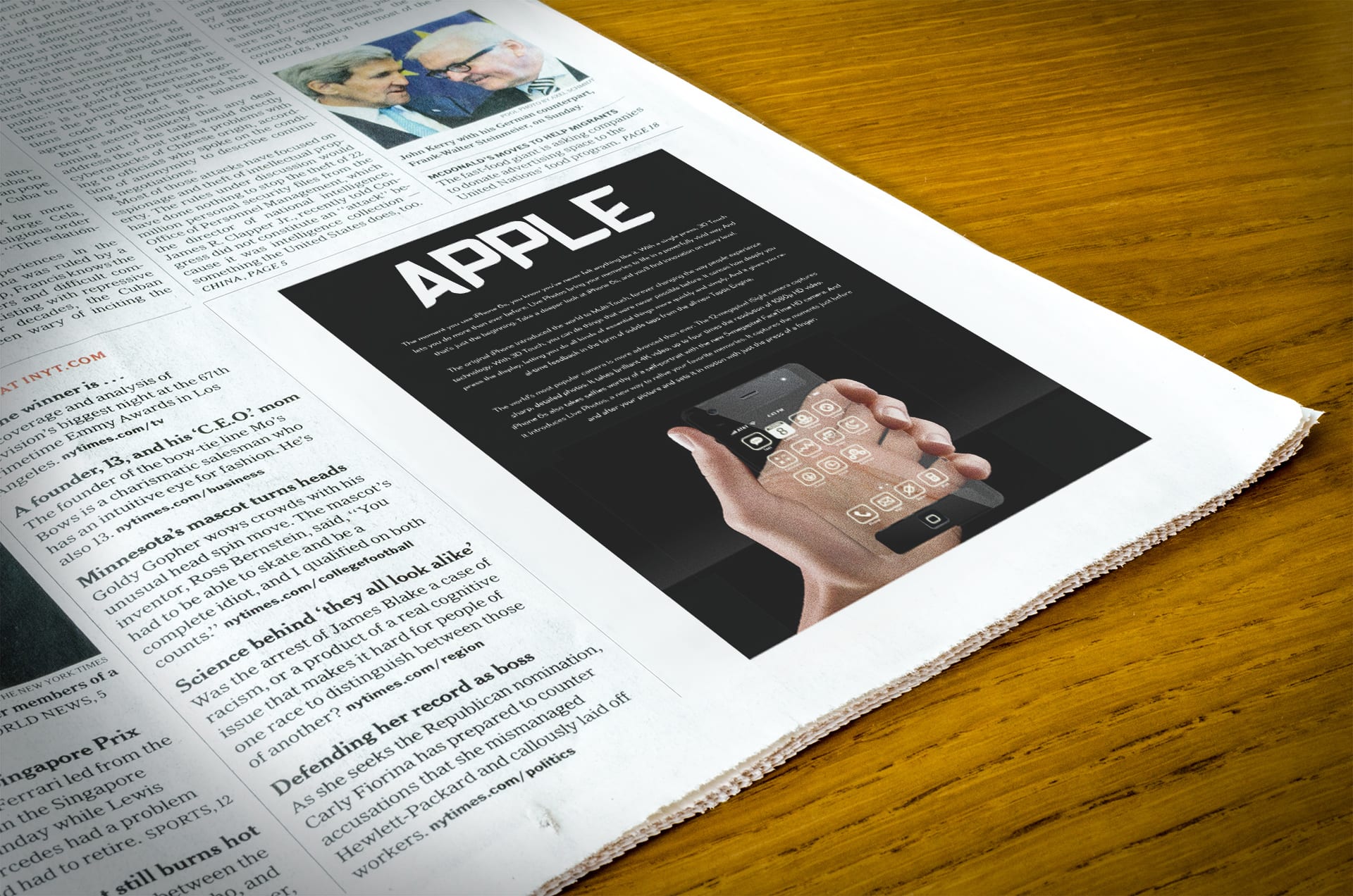
This is Slant Edge. I’ve mixed two font styles together to create a hybrid of sorts. Similar to one of my other designs I have a rounded edges along the bottoms of each letter. I like this because it gives the type a sense of informality to it meaning that it bends the rules and loosens the noose within corporate standards, giving the product a interesting twist. Next is the product placement.

Apple

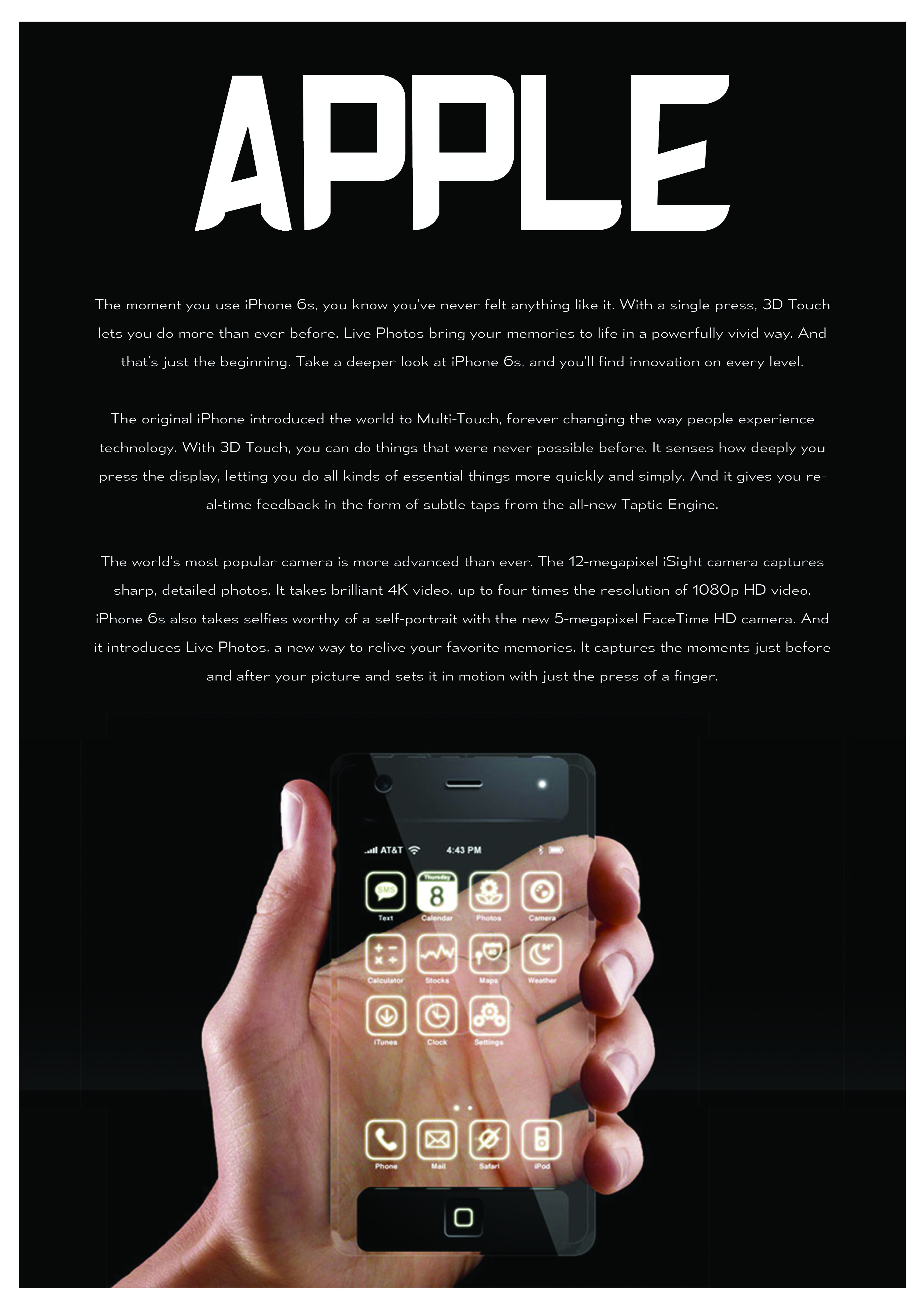
For this I found a piece of concept art and placed it within a poster as a way of making my own product. I feel that the font works well with the format and style of the piece. It looks professional and doesn’t draw too much attention away from the main product. Below are some examples of the product within the public.

Apple Billboard Apple Newspaper


And that’s my final piece.

Michael Rice

Still experimenting

I’m experimenting. I like it because I’ve taken an already aesthetically pleasing type and edited it to make it more interesting and fluent. The font that I’ve edited is BARON NEUE.

Altered BARON NEUE

I’ve got a two versions but here is my favourite one.

I like this one because I’ve gotten rid of the edges on some of the letters. It gives a futuristic look which is what I was going for in the first place.

Altered BEBAS NEUE 2


This is the second one that I designed. Personally I’m not a fan as I feel the shaded areas stand out a little too much.


Altered BEBAS NEUE 1

More fonts!

I’ve designed two new fonts. Pretty happy with them.

Curved Edges

Slant Bridges

The First Two of Six

The first two fonts that I’ve designed. The top being a very simple and straight forward Sans Serif and the bottom being a slightly more stylish, featured design.

Two Digitized fonts copy

Inspiration!

Now that I’ve got the theme I’ve started to focus more of my attention on well known/iconic designers within the world of type. I’m starting with Neue Grafik (more of a group of artists than a single one). Neue Grafik (1958 – 1965) consistently filled it’s pages with beautiful sans serif type deeming it an iconic and distinguishable piece of design. The infamous type that is Helvetica was a big feature within the magazine. Helvetica is, as everyone knows, the most famous and recognisable of all the sans serif types.

neue-grafic-spreads

From these two examples of design, I’ll be looking directly within Neue Grafik to gain ideas about kerning and positioning for the type. Segway-ing from this to the next, I’ve been looking at a lot of Paul Rand’s work due to how his work on corporate logos links nicely to my themes within instructions and electronics, making something easy to read and very recognisable.

abc

His most noted work is on the ‘abc’ logo, the American TV network. The logo has been the same (with a few minor changes) since 1962 and really has stood the test of time. There’s no reason to change a logo like that because well, if it ain’t broke don’t fix it. From this logo it’s sparked a few ideas in my head involving shapes, something that I could use in order to form letters. Moving onto another logo designer, we find Massimo Vignelli, the man behind the well known ‘American Airlines’ logo. The logo serves two purposes, 1. sending a message about the company that’s easy to read and recognisable. 2. representing what the company stands for.

BBOF2d9CIAE5YOv

The logo is easy to read as the type stands out and very recognisable. It also represents the company with the colours being red and blue, i.e. the colours of the flag as well as featuring an eagle between the letters. The eagle is a connotation of America. The logo was created in 1968 and stood proudly on the Aeroplanes until 2013 when a new, less understandable logo was created.

Finally I’ve been looking at the work of Matt Judge of ‘Designjudge.co.uk’. Not so much focusing on type but design in general I’m looking at Judge as a source of inspiration into how type and different objects are positioned and how sometimes less is more. I admire his unconventional website (which has links that, when clicked, bring up a prevention of work), which in someways can be used as a design study on it’s own.

Screen Shot 2015-10-18 at 15.54.40