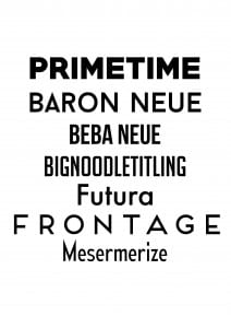
Here are some examples of the Sans Serif fonts that I generally use on a regular basis whenever I’m messing about on Photoshop or InDesign.
Category: Typography (page 2 of 3)
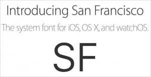
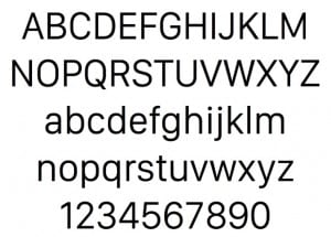
So now that I’ve got a solid theme going I’ve decided to snoop around and look at different websites held by major players in the electronic device game, mainly Apple and Samsung. I looked at Apple because in recent months they’ve actually designed a new house font for their use only. Calling it ‘San Fransisco’ the font is simple yet noticeably different to the standard Helvetica ways of their devices before iOS9. Personally, I really admire it as it gives the Apple products yet another push out into the ‘unique’ frontier.
I like it because it’s crisp, clean and to be honest, I’m a sucker for beautiful Sans Serif fonts.
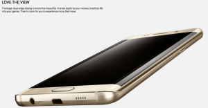
Aside from this I also looked at Samsung and Xbox (noting Microsoft). With Samsung I took a look at the font use within the advertisements of the Galaxy Edge+. I did the same with the Xbox website.
Granted the pictures aren’t the clearest in the world but you can see that, across all the websites I looked at, the use of the Sans Serif within technology is highly common as it mimics and compliments that of the devices it’s used in conjunction with. So obviously, this is the direction to move towards.
I think I’ve decided on an overall theme. I say overall because there’s two and of all my ideas these are the final ideas that I’ve picked over the others. That make no sense. My two themes focus around simplicity and instructions. Within these I’m focusing on electronic devices and street signs.
I feel that, in this day and age, to make these products and services, you have to pick a simplistic type to go with it to make the product easily understood. In some ways having a simple type is the fundamental underlining of both these themes, being that with electronic devices the type needs to be easy to read and easy to see and likewise with street signs.
My ideas for the 6 new letters are as such; designing something that can be easily read and understood yet feature unique characteristics that convey the context of the theme.
As well as Abduzeedo being a fundamental source of inspiration for me, Pinterest is probably the second biggest course of inspiration. Similar to Abduzeedo it has a range of examples of graphic design and typography but the reason it’s the second biggest source of inspiration is because Abduzeedo is just nicer to look at…. Simply put.
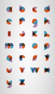
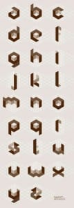
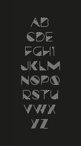
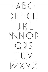
While I was mooching around on Pinterest I found these wonderful pieces of type. Amazing.
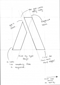
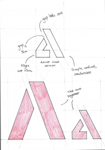
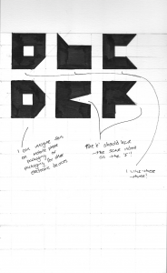
After seeing the second one, I decided to give it a go and immediately hated it and stopped. I tried again and found that something better had grown from it.
In this piece I’ve taken the idea of geometric design and merged it with flat design to give this odd looking, edgy type. Personally I really like the way that on letters like ‘b’ and ‘c’ the ends are just half blocks as this helps add to the simplicity and quirkiness of the font.
