I’m including these together because they are very similar.
The website features a single scrolling interface with buttons at the top and bottom which allows the user to go through pieces individually if they wish to do so. Below is a look at the entire website (without mockups).
 (Website without overleaf)
 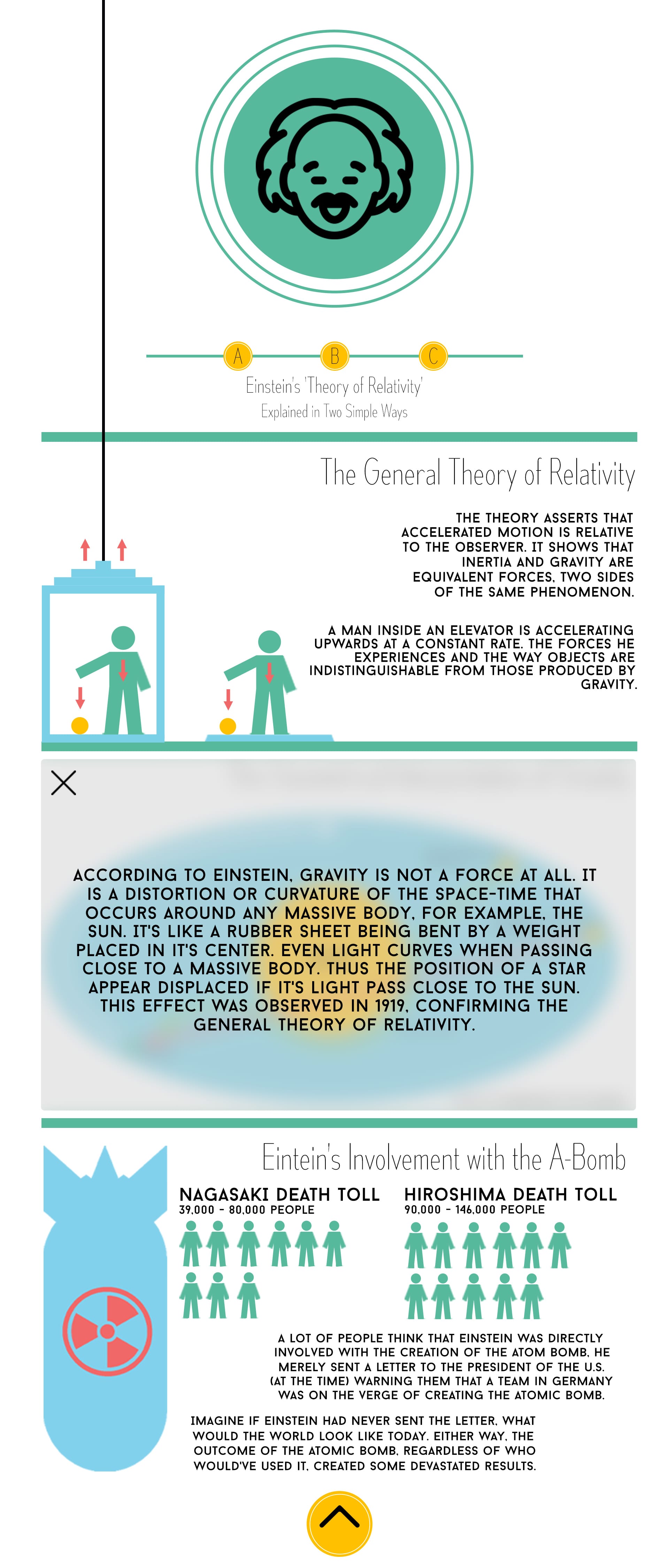 (Website with overleaf)
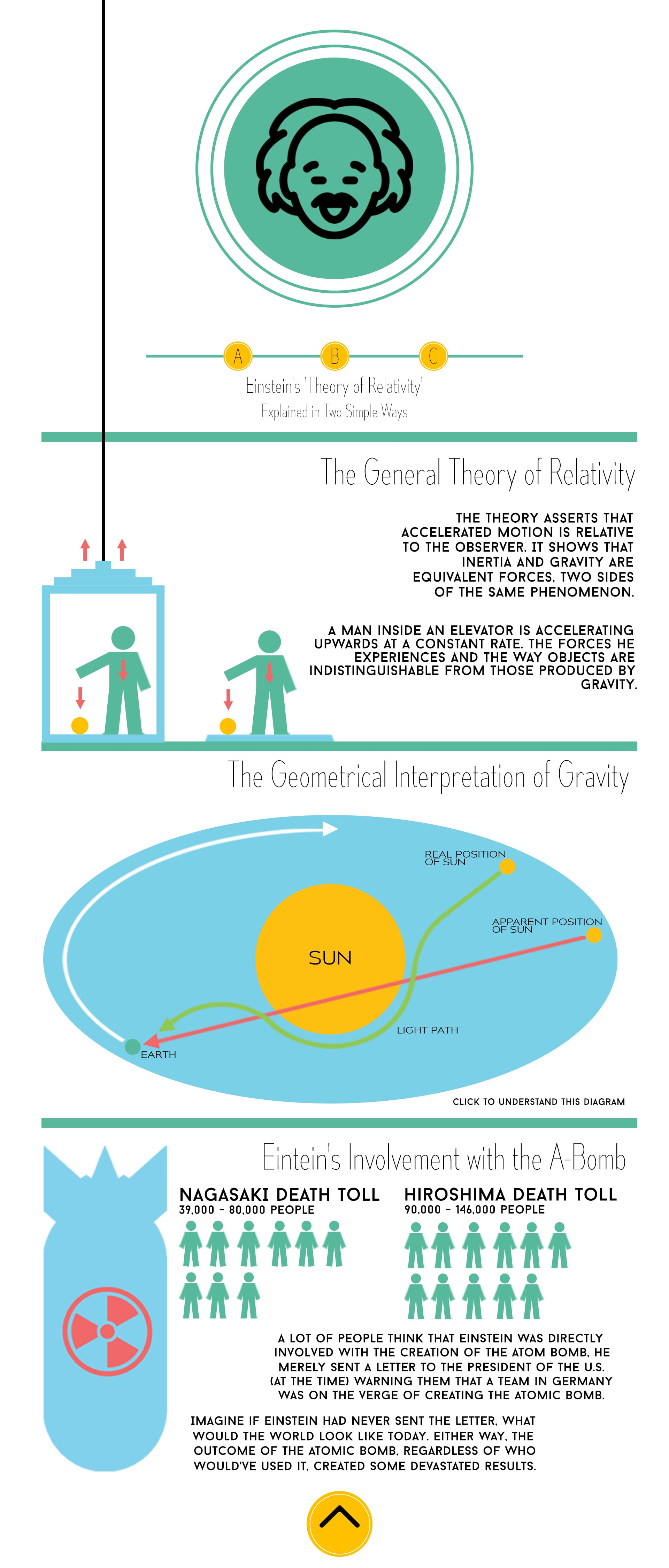
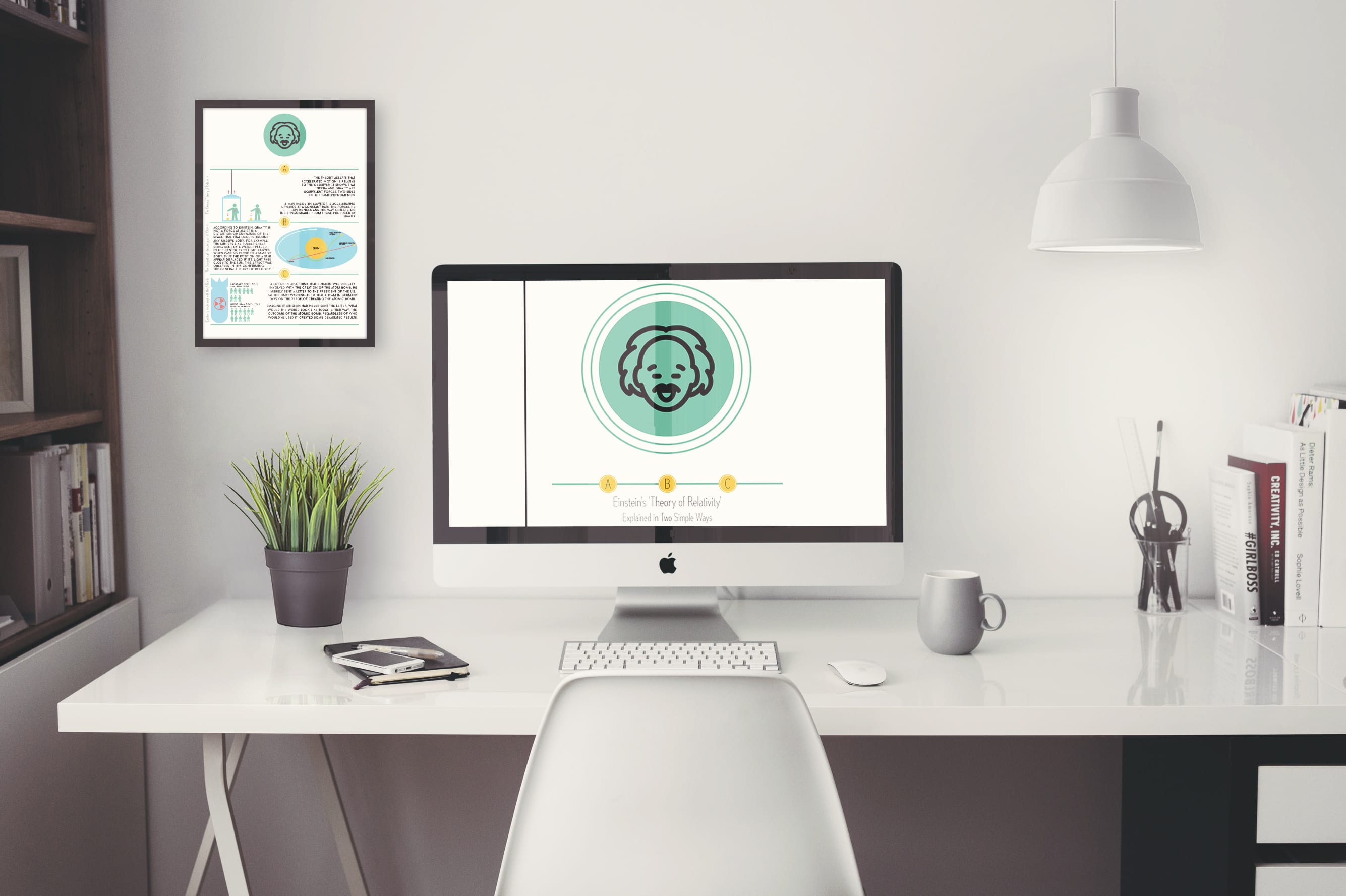
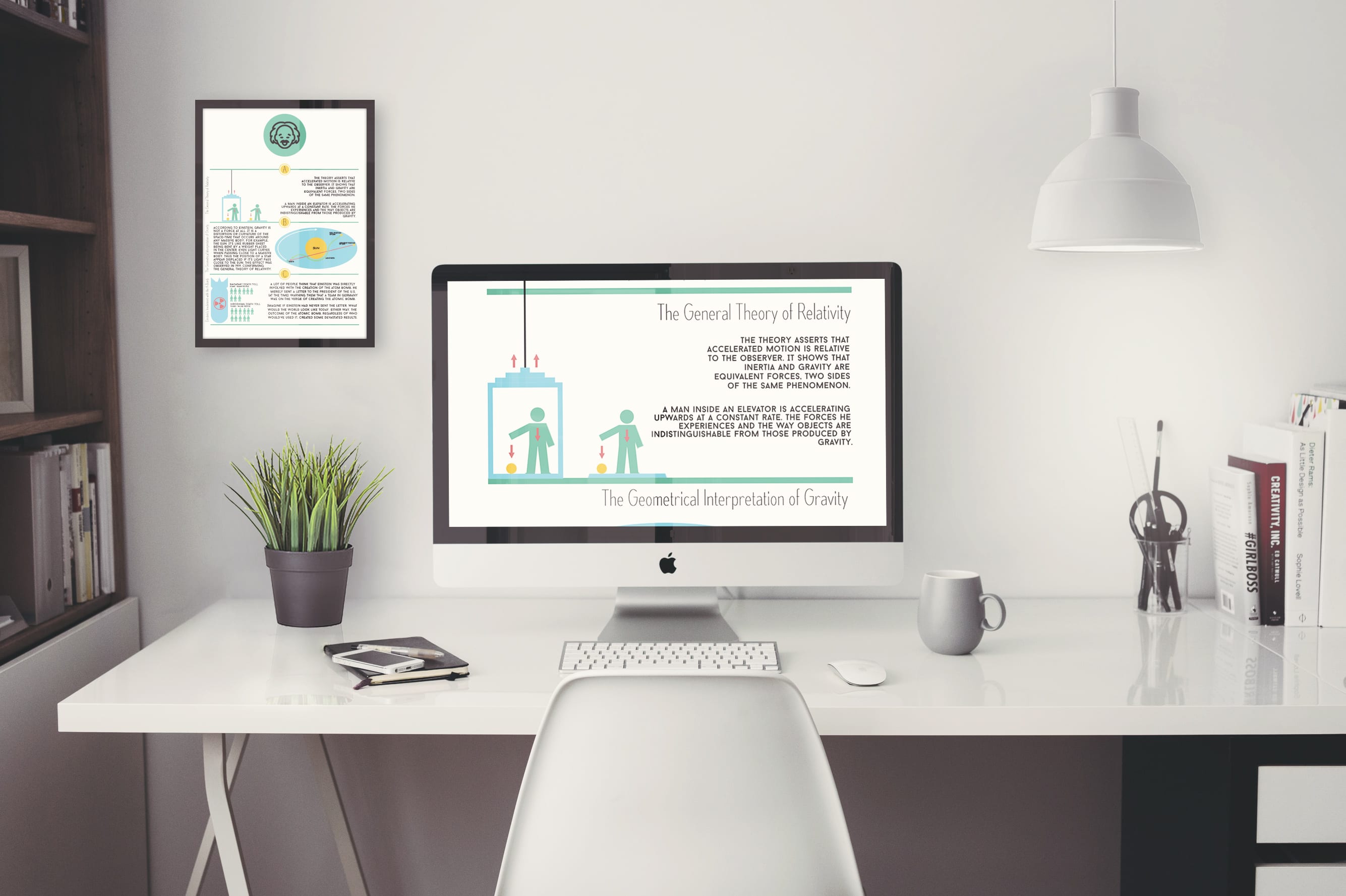
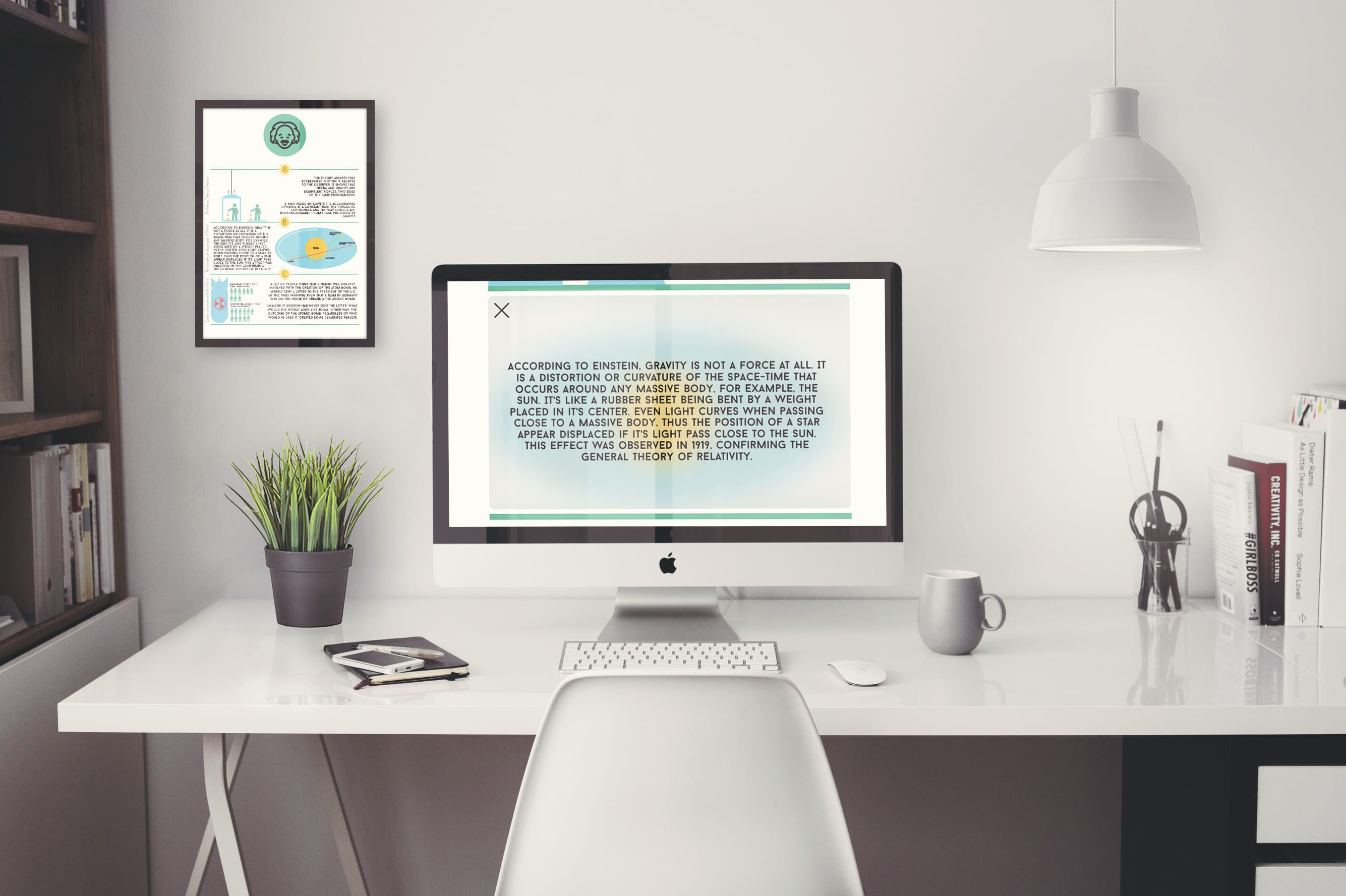
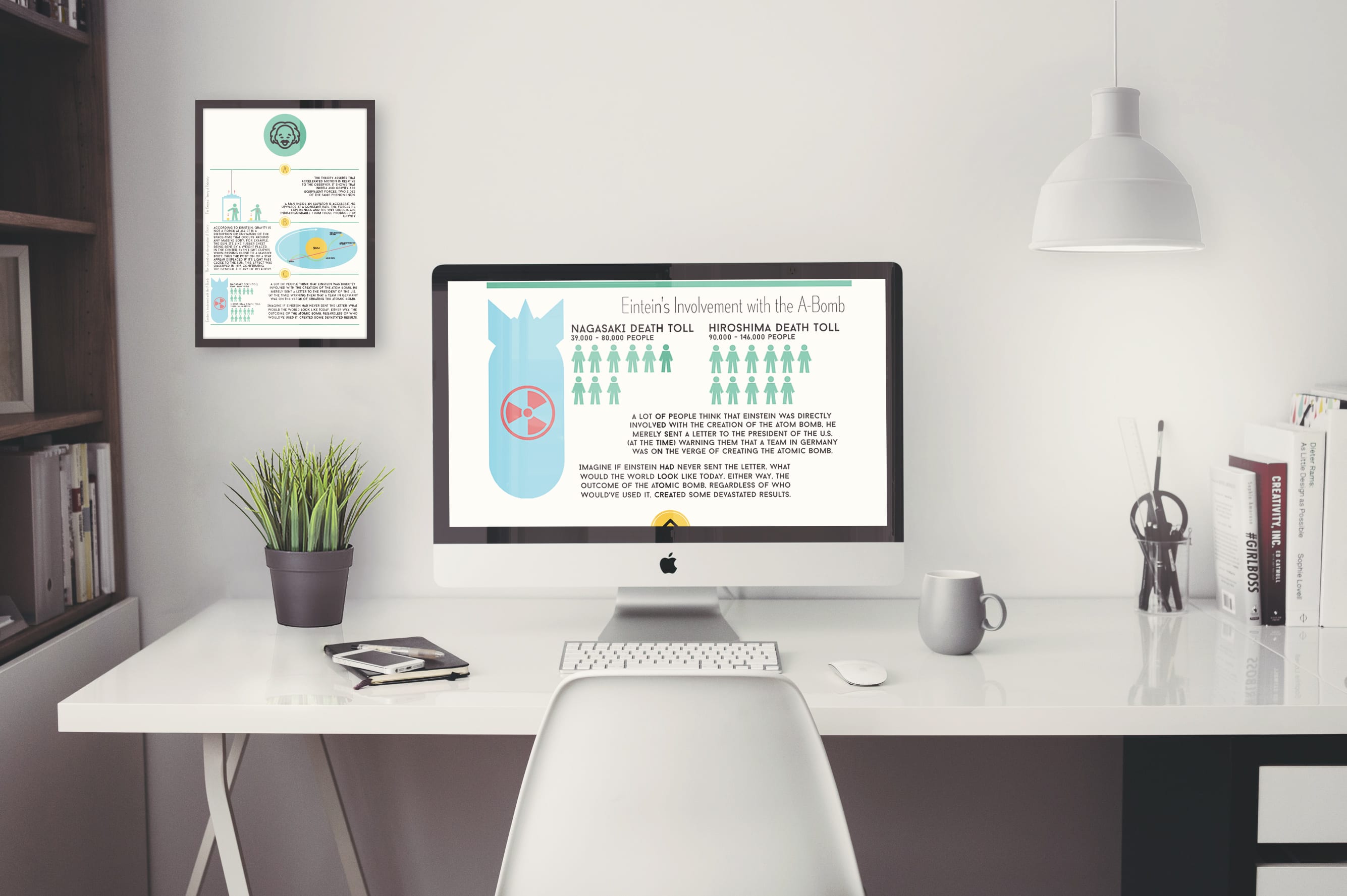
I’ve used the interactive logo which allows the user to work out that this infographic is interactive. The three icons below the logo react with each fact and if you press one it will scroll down to the corresponding fact. On the second website it features an overleaf on the second fact and this is there so that more information was made available. I used the Gaussian blur tool which gave the background an interesting, visually pleasing look while at the same time allowing the information to be easy to read. I’ve featured the same colour palette on the website as I have with the app allowing a sense of continuity to be carried across each media form. Below are some mockups (with the poster in the background).

Now I’ll talk about the poster design of which you can see within the mockup above. I’m proud of this because I like compact design where everything that needs to be there is there, allowing only the appropriate information to be presented.
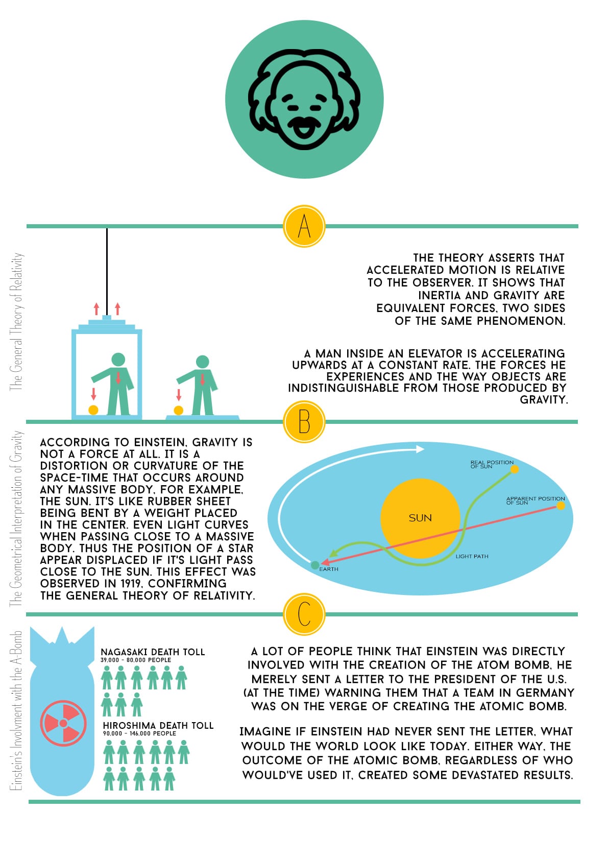
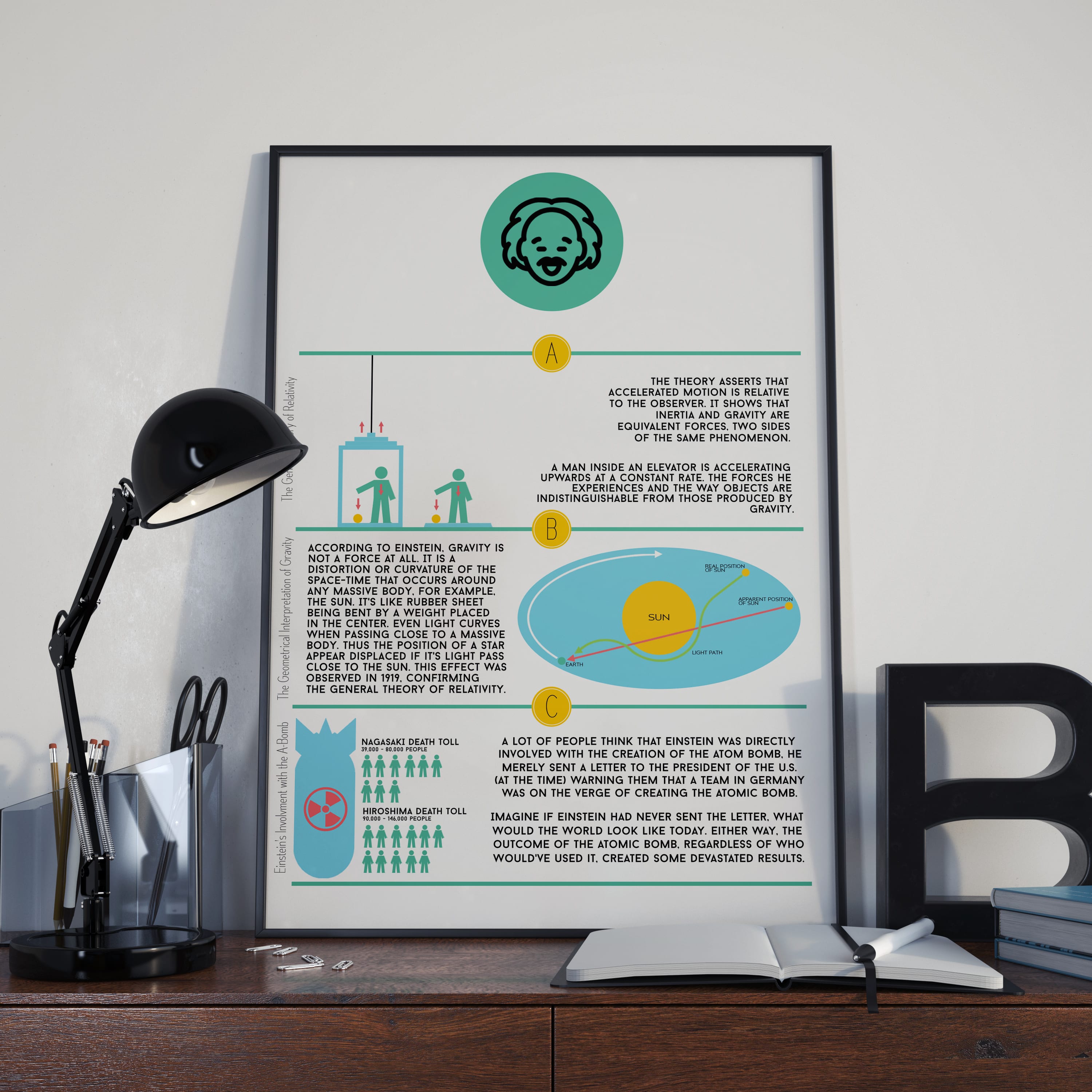
With this design I’ve featured the logo that represents the physical form of information, meaning that the piece isn’t interactive. As with the website and the phone app, I’ve carried across the colour palette and continued a consistent sense of simple design across all platforms. I’m happy with all the designs (with the unfinished app as well) as I’m happy with the consistent design features that have been brought over across all of the pieces.
Comments are closed.