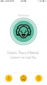
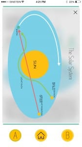
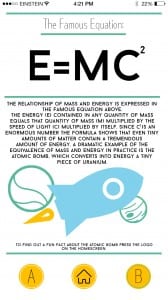
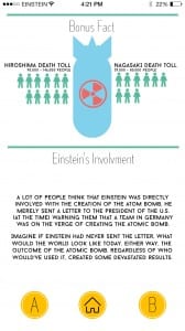
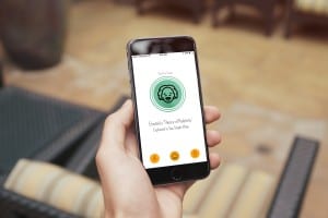
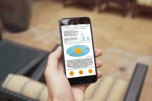
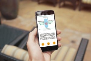
Here is my final design for the app version of the infographic. I’m extremely pleased with how this has turned out and despite there being a fair amount of changes the overall style and theme remains the same. For me the part that stands out the most across the project is the colour palette due to how well each colour works together.
I’m pleased with the overall design of all the pieces because it gets across the style of simplicity. My target audience was people with a similar age range to me as it’s something that I would want to use and judging by that result then I feel the target audience aim has been achieved. The use of the colour palette works well on the app as it adds to overall idea behind the flat design and it makes the app look professional. Below are some mockups of the finished app design.



Comments are closed.