Once again we wander back to the previous brief with ‘Le Barbe Magnifique’. So I’ve now started working on the website design for the company, therefore creating the first steps into the new world of marketing. To go with the simplistic style and classy, modern look of the logo, I decided to try and replicate this with the design of the website.
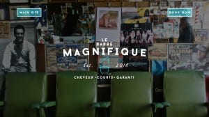
The first image is the intro page, the page users are greeted with upon visiting the site. It’s an intriguing vision, having nearly nothing on it but at the same time giving you the exact amount of information needed. We have two options, a ‘Main Site’ and ‘Book Now’ button, both of which would link to other pages of the website. The colours of the page are similar to that of the logo, therefore keeping a steady consistency for which customers would become used to upon further use. The image in the background is designed to give the website and business a vintage feel while also making you feel welcome with the row of seats at the bottom.

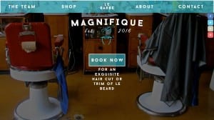
The second image is that of the ‘Main Site’. This has all the main features on, allowing the user to find out more about the business, shop for their own razors and other shaving goods or book an appointment with the firm. The words underneath the ‘Book Now’ button are designed to carry on this sense of good humour, yet again giving this business a unique look to it. The background picture is also a set of chairs, once again delivering that welcoming feeling that is so important towards a new business. The colour screen has continued the consistency that is just as important to a serious, confident business.
As I progress with new pages I’ll update.
