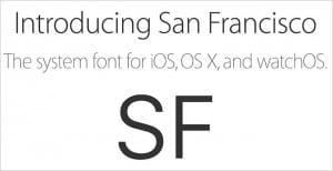
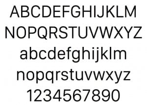
So now that I’ve got a solid theme going I’ve decided to snoop around and look at different websites held by major players in the electronic device game, mainly Apple and Samsung. I looked at Apple because in recent months they’ve actually designed a new house font for their use only. Calling it ‘San Fransisco’ the font is simple yet noticeably different to the standard Helvetica ways of their devices before iOS9. Personally, I really admire it as it gives the Apple products yet another push out into the ‘unique’ frontier.
I like it because it’s crisp, clean and to be honest, I’m a sucker for beautiful Sans Serif fonts.
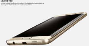
Aside from this I also looked at Samsung and Xbox (noting Microsoft). With Samsung I took a look at the font use within the advertisements of the Galaxy Edge+. I did the same with the Xbox website.
Granted the pictures aren’t the clearest in the world but you can see that, across all the websites I looked at, the use of the Sans Serif within technology is highly common as it mimics and compliments that of the devices it’s used in conjunction with. So obviously, this is the direction to move towards.


Comments are closed.