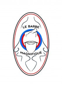
So I decided to try and see what the logo would look like as a label. I drew the swirls that you see on the picture. To be honest it’s a bit crap. But alas it’s given me new ideas!
Page 5 of 10
So along with my other idea for a logo I’ve decided to go a more generic route and incorporate a hipster-ish beard into the logo. At first glance I actually really like it. The cliche use of this style makes the piece look familiar but at the same time look unique due to the sketched style and the bold colouring. Below I’ve attached the tests and final look of the beard design. Despite there being a ‘final’ beard design, it’s still a very early phase.
So this image consists of my first ideas. I preferred the first image due to it’s simplicity and fluid sense of direction compared to the others. With Face 2 and 3, they seem very straight and the use of the point in the beard seems too formal. In Face 4 I decided to use the same beard type as the first but this time play around with the hair style. I ended up deciding to go with Face 3 and 4.
As you can see, the second face on the image above seem more suitable and eye catching. Personally I liked how the beard looks on the second face but I decided to play around with the moustache types as seen below.
Out of the three moustache types, the third one seems clean and minimalistic whereas the other two before it seem clunky and they take up too much space across the face. I ended up going with the third moustache. I then decided to play around with colours and layout compositions. These were very minimal and still need improving.
With all of these logo tests, they all seem to pop out in front of you. They could all be used for the same thing, the two single colours could be used to differentiate certain products and the circled logo could act as the main logo. With the first logo I like how the beard runs above the circles, giving it a 3 dimensional sense that pops out at the viewer. I’ll continue to work on these and see what I come up with.
With any business you need a form of marketing, a way of promoting the brand so that a range of people within the target audience and outside the target audience can be made aware of your services. A business card is a good place to start once a business has created a logo and identity. The business card is something that can directly link a customer to the business so it’s important that it carries along the main features of the logo and identity.
This includes the colour palette, the main prominent piece (or all) of the logo and the relevant information. I’ve looked into this via various different barbershop business cards just to get an idea on the type of information that’s being featured.
These two business cards are unique and eye catching despite the minimalistic tendencies. This is predominantly aimed at the card on the left due to it’s simplistic branding. The only way that a customer can tell that it’s for a barbers is due to the tiny scissors icon yet once we’ve seen this it’s instantly recognisable as a barbershop of some kind. Both of these feature very ‘hipster’-y features, being on par with their competitors who tend to aim at men with large beards and large glasses.
Despite these features, both are rather unique in their own way and they are instantly recognisable to be associated with a barbershop/hairstylist of some kind. They feature a similar colour palette and stick with them across their design.
Here’s a few first ideas that I’ve sketched down on my mac. I’m seeing whether or not an idea like this would work, having a logo that symbolises an area or group of people claiming and appearing in a certain area. It would represent the company coming over and making their mark within the country.
I’ve done a few logo designs, just ideas and experiments to see what would work on the flag. I like the idea of the have a sketchy looking logo, something that’s unique and slightly rustic.


