I’ll start with flat design, as that’s what I really want to incorporate into my infographic. I found a graphic design artists named Adam Rudzki, a Polish designer who’s worked with many different companies, making websites, apps and different interfaces.
http://adamrudzki.com/#
To start with, his entire website is a scrolling, flat designed marvel. It features a range of different pastel colours and icons that just jump out at you. This is exactly what I want with my design.
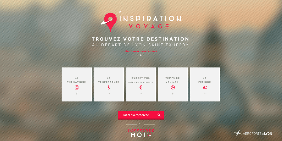
Next is with a website. The reason why I’ve picked this as a research piece is because I love the colours, they stand out right in front of everything. I found the website on http://www.awwwards.com/websites/flat-design/, a website that promotes and celebrates good design. With this one it just stood out to me with the contrast between the blocky colours and the blurred images that falls behind. This is something that I want to incorporate into my design, bright colours that catch your attention.
Finally I found a group that design infographics for a living and they are beautiful. http://www.mikewirthart.com/portfoliopage/
There’s no fault with it and, similar to the first one I noted down they have a scrolling website that features beautiful icons and pastel like colours. They use all kinds of shapes and colours as well as different subjects that set them apart from anything else. I like these as an artist because, again like the others, I like the colours and I feel that in an infographic colour is important because that’s what draws the attention to it and I’ve noticed that most infographics all have a specific palette of colours.