So here are some fonts that I decided on during the project. I gathered a range of different typefaces all in similar styles as this would give my enough space to lean back on if I chose to use different font styles. Below are what I got:
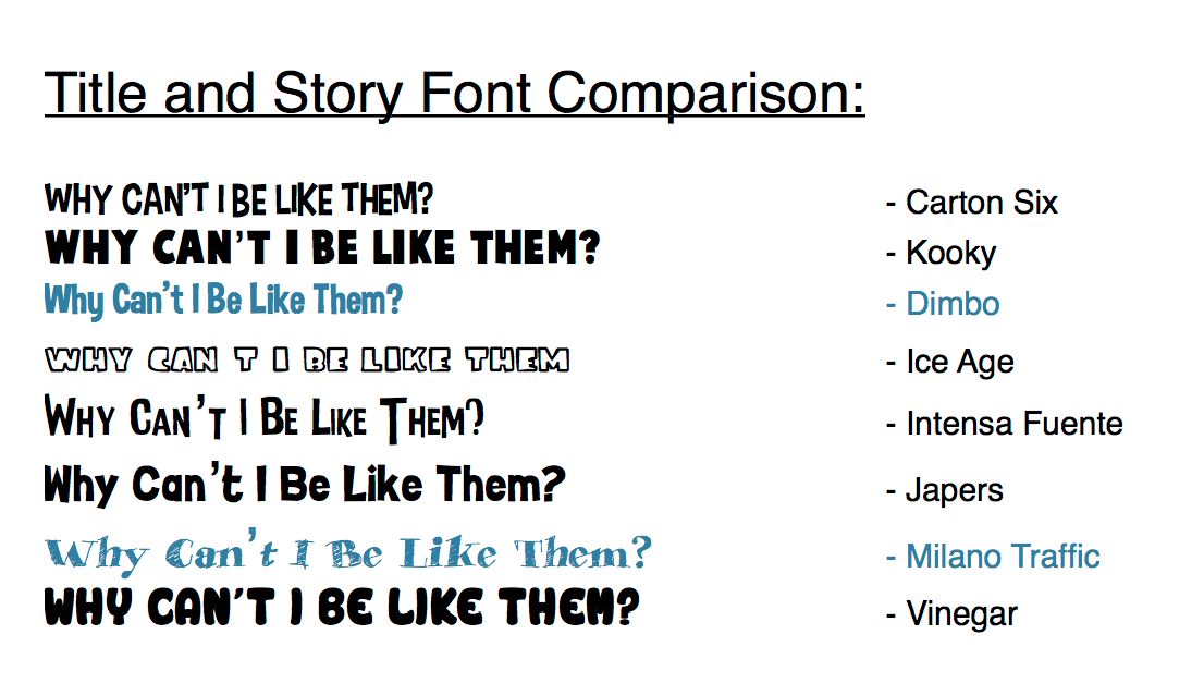
Out of all of the font types, I chose Milano Traffic for the title/cover type and Dimbo for the story text.
Font 1: I felt this was a little too cartoon-y and I felt that it would be too hard to read while in big caps lock. I wanted something simple and easy to read.
Font 2: This was reasonable and I considered it but I felt the boldness was too much weight for the pages, it created a vast amount on contrast between itself and the background images/the main pictures.
Font 3: I decided to go with this font for the simple reason of it fitting nicely on the page. It presented itself perfectly and in my opinion I feel that it works with the pictures on the next pages. It’s easy to read and looks good in multiple colours.
Font 4: I decided against this for the simple reason of it being to large and clunky.
Font 5: I felt this font was similar to that of Dimbo but the lengths were too long, in my opinion this type face would stick out like a sore thumb.
Font 6: I almost chose this one for the story text but felt it was too formal.
Font 7: I selected this for the title font because I liked the handwritten look to it. It matched the style of the drawings slightly and looked the part, especially for a children’s book. I also needed something that stood out and I feel that this typeface does the job as it looks nice, sits boldly across the page and attracts attention.
Font 8: I ignored this one simply because it looked too cartoonish. Too childish for the style of the story and design.
Comments are closed.