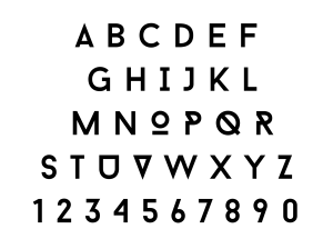
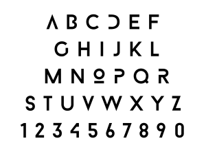
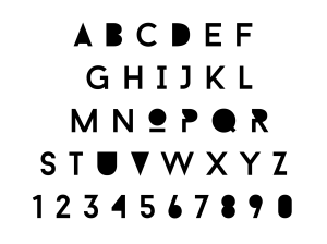
I’m experimenting. I like it because I’ve taken an already aesthetically pleasing type and edited it to make it more interesting and fluent. The font that I’ve edited is BARON NEUE.
I’ve got a two versions but here is my favourite one.
I like this one because I’ve gotten rid of the edges on some of the letters. It gives a futuristic look which is what I was going for in the first place.
This is the second one that I designed. Personally I’m not a fan as I feel the shaded areas stand out a little too much.


