Page 3 of 10

Eric Carle – Artist Research

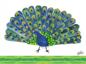
This guy right here is responsible for the artwork inside a childhood favourite among many, ‘The Very Hungry Caterpillar’. His art style has grabbed my attention due to the way he appears to overlay the character design on top of the character outline and this I feel is something that I’d like to try. Below are some images/examples of his work.eric-carles-fluttering-butterfly_nb1284_1 eric-carles-giraffe-mother_ni2616_1 eric-carles-peacock_ni2618_1

As well as having an intriguing design to them, each piece of art is very colourful, therefore doing it’s job in attracting the attention of young readers. I particularly like the contrasting colours in each picture, especially with the butterfly picture where due to the nature of the animal there’s a lot of varied colours plastered across it.

From here I’m going to create a few textures/designs that I will place below character designs. One reason why I like this style is because it seems endless, the designs just fall off the outlines and keep going meaning that nothing is restricted.

First Initial Sketches – The Panda


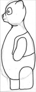
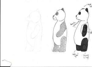
Some initial sketches of Barry the Panda… Not particularly proud of them but it’s a start I guess.

Panda Sketches v2-1 Panda Sketches v2-2 Panda Sketches v2   Panda Sketches

Further Research for the Child’s Book!

So I want my book to look similar in style to that of ‘I Want My Hat Back’, as I explained the previous update. The reason being is I like the simplicity of the artwork and the fact that the background colours are enough to crete a sense of surrounding alone. Alas, I can’t just focus my efforts around this one book so I’ve done more research into more styles of art found within more books.

‘The Very Hungry Caterpillar’ – Eric Carle

caterpillar 10-11LARGE._V192572398_


“The Little Engine that Could” – Watty Piper

maxresdefault enginetopofmountain1954_custom-b15bf10eec2be37e60c87cc064b5a63f864acc83-s900-c85

“Don’t Let That Pigeon Drive the Bus” – Mo Willems

hqdefault itheatre


The reason why I like the artistic styles is because of the bold lines and the simplicity of the colours (mainly within the last two book examples). Within ‘The Very Hungry Caterpillar’ artwork, I like the fact that the colouring continues off of the subject, so beyond the animal would be more colour and I would like to try and use this style within my story artwork. Within the other examples, I like the bold colours and bold lines that create a visible boundary and outline for the subject.
Within my artwork, I really want to try and make a minimalist piece that serves a purpose of providing enough information to back up the text while at the same time providing an intriguing and entertaining source for the reader. The colours will be eye-catching and if I use a similar style to that of ‘The Very Hungry Caterpillar” then the book will be intriguing to look at.


Current state of Branding

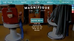
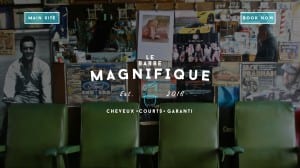
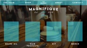
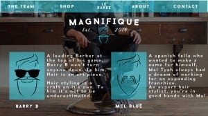
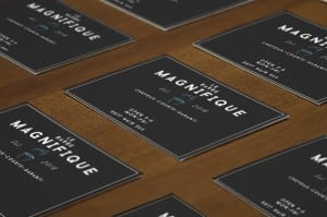
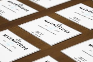
So here’s some images of what the website looks like at the minute. I’ve also included a mock up version of my business card designs.

Contact Page Home Page Intro Page Shop Page with Open Section Shop Page Team Page


Mockup 1 Mockup 2

Picture Book – New Brief

So I’ve restarted this three times now and finally I’ve got a good idea! The brief in question is to create children’s picture book that helps explain a harsh or difficult subject. I’ve gone with the idea of accepting yourself and being okay with how you look.
I’ve decided to tell this story through the means of animals and the way they look, seeing as there are so many different types of animals, I feel like this is a good place to create the story within. The story revolves around a Panda named Barry living in a zoo with all his friends. He notices that the other animals are getting a lot more attention from visitors so he hatches a plan to change this. He paints his fur to look like those around him to see if this will gain him more attention, the plan fails and he relies on his Panda friend to help him, who tells him that being himself is more than enough to get attention and that he should be proud of the way he looks.

My main place for inspiration is that of ‘I Want My Hat Back’ by Jon Klaassen. The main piece of inspiration for my story is that of the artwork as it’s very simple yet effective in exploring the emotion of the characters. I also like the backgrounds as once again they are very simple, minimal yet they seem to give the art so much more character. It also allows the reader to focus on the beautiful animal designs.

i-want-my-hat-back-showdown


I want my book to be similar to this, I would like to have a minimal background and a lot going on with the character designs.