Page 2 of 10

Completed Branding – Finished Logo and Business Card

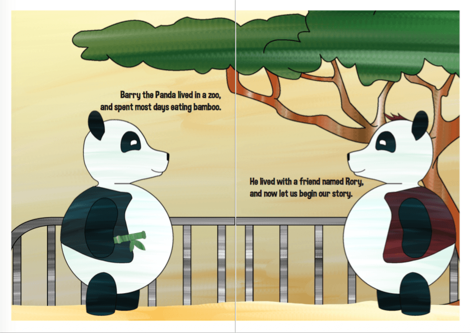
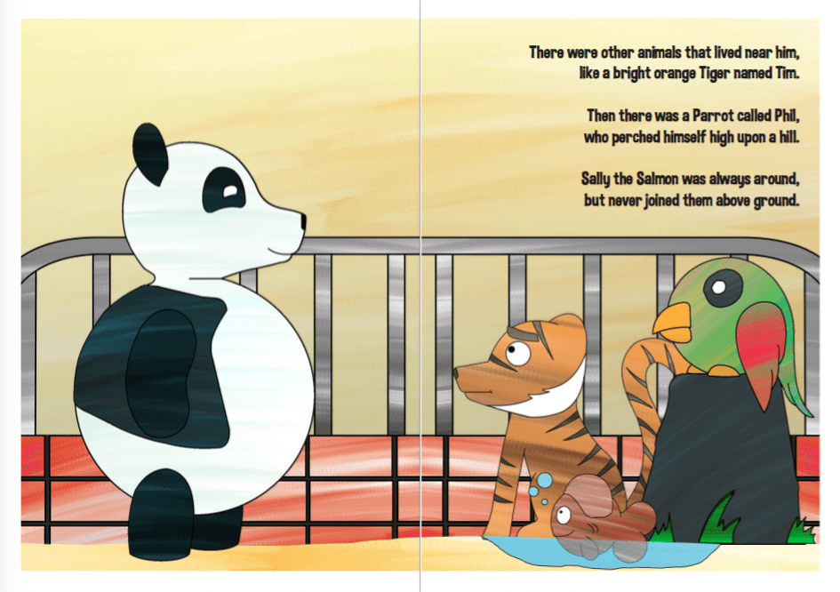
So I’ve now completed the Branding brief. I’ve created a new website, various business cards and a smashing new logo for the already classy barber shop, ‘Le Barbe Magnifique’. Below are my results.

Final Logo

Mockup 2 Mockup 1


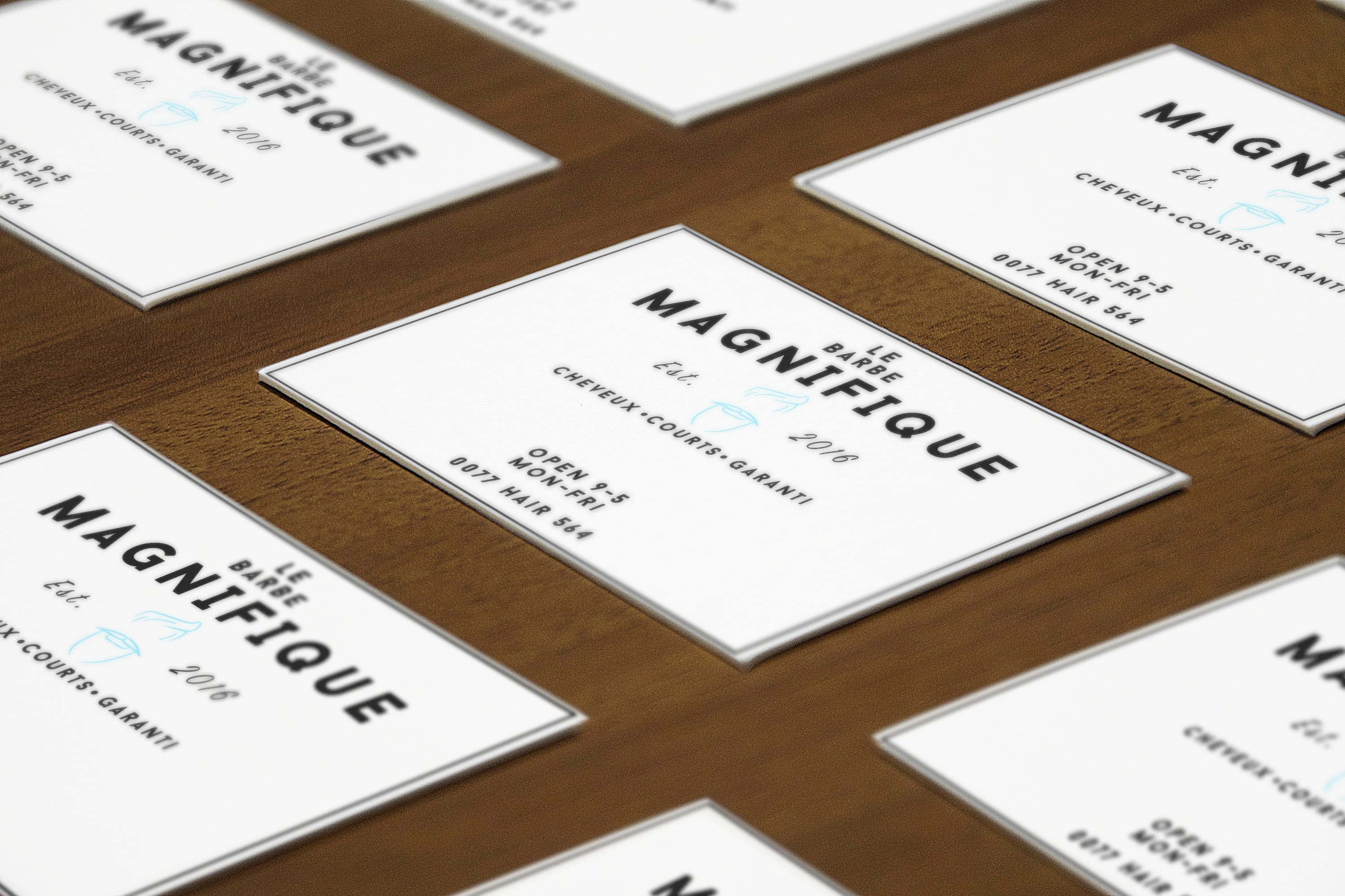
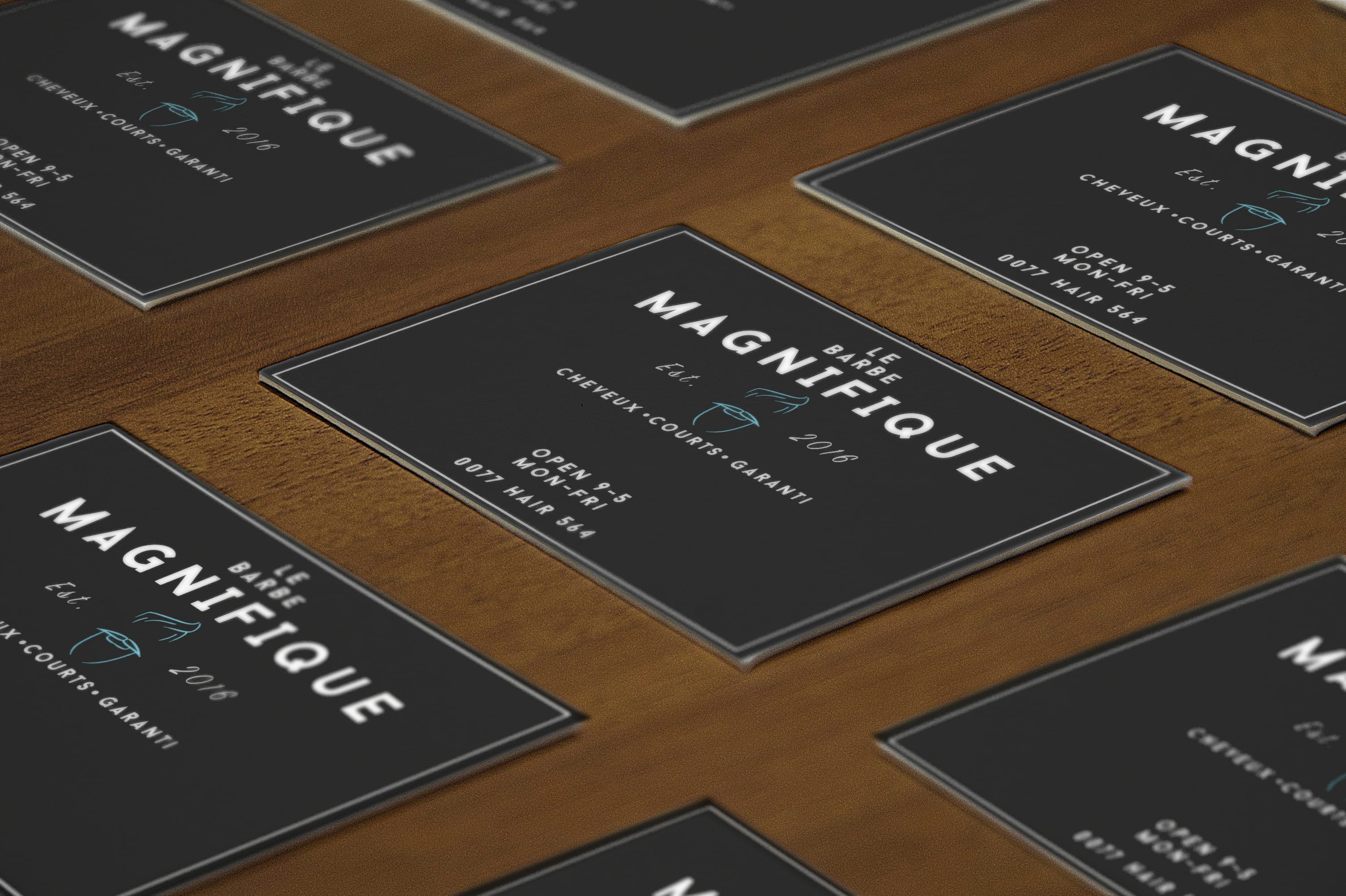
Overall I am very happy with the outcome of the logo. I feel it’s formal, quirky and above all professional in how it appears to customers new and old. Franchising a company overseas can be difficult so acquiring the perfect logo is key as this is the door to a new branding identity. The colour palette for the logo matches that of professional standards and stays consistent across the entire design process of the company.

So I’ve decided that I don’t like my current designs/style so I’ve decided to change it all and rework it. Only a week until the deadline… not bad.

So the original designs have turned out looking rather flat and lifeless with lack of shading and really just a visual lack of motivation. I feel the motivation is down to the techniques and outcomes of the pages, for example I have been using a tablet and illustrator to create the past work and this just hasn’t been working for me. So I’ve decided to work on hand drawn sketches and this is already proving to be working a lot better than before. Below are the original designs.
Screen Shot 2016-04-15 at 18.47.17 Screen Shot 2016-04-15 at 18.47.25

Now for the new designs.

Panda  Screen Shot 2016-04-15 at 18.49.10Screen Shot 2016-04-15 at 18.48.25


Having them hand drawn has given each character a new look and I’ve actively tried to create a rustic, unfinished effect to the piece. By doing this I’ve made it look similar to that of a illustration that a child has coloured in, something where the colour goes off the lines (I’ll work on this and try more of it?).
By splitting the text and images up between two pages, it strengthens the composition and allows for easier reading. The drawings also look less flat and appear to have more of a dimension to them, making it nicer to look at and gaze upon.

Second load of character designs

Here’s the second load of character designs, which includes a new look Panda design and a few new characters. panda panda0002

ArtWork Research

Kung Fu Panda. Pandas. Reoccurring theme there but relevant. When watching the Kung Fu Panda movies, the parts that always stand out to me most are the areas concerning backstory due to their specific art styles. They seem to be very abstract and bright which in turn reflects and aids the effectiveness of the story that’s trying to be told.

1339608420_2 kung_fu_panda_2_screencap___lord_shen_by_mr_lord_shen_fan_2k9-d5jrwk6

I really like this style of art. It’s bold, bright, eye catching and effective in aiding a compelling and action packed story. Ideally I’d like to try and incorporate this style into my work.


LWSword protectedimage.php

If I did incorporate this style into the children’s book, I’d need the colours to be brighter and more friendly to the younger reader. It might be an interesting idea to blend the two styles that I’ve spoken about as seeing the bold and bright colours mixed with that of Eric Carle’s techniques might make something intriguing for the reader.


Art Style Designs – (Eric Carle Inspired)

Below are a few designs that I’ve created for my planned characters. I’ve included (In this order): Panda White Fur, Parrot Green Skin, Fish Skin and Tiger Orange Fur. The idea behind these is that I’ll place them underneath each character design and in doing so I’ll be replicating a technique found in Eric Carle’s, ‘The Very Hungry Caterpillar’.

Texture 2 - Panda Texture 1 - Parrot Texture 1 - Fish  Texture 1 - Tiger