Critical Evaluation – Branding and Book

Branding Brief Evaluation:

I personally enjoyed this brief very much as I enjoy redesigning and creating new products on Photoshop and InDesign. I felt that overall, my response to the brief was met accurately as I created a unique, bold logo for the company that screamed quirkiness and professionalism. I kept to a slim colour palette and kept this consistent through the branding design. I’m very happy with the consistent look of the branding but I feel if there were any improvements to make, it would be with some of the products I created as well as maybe doing a little more research. Overall I’m happy with the look of the new brand.


Children’s Book Evaluation:

This brief to me was slightly challenging as at first I couldn’t come up with a solid storyline for a book suitable for children. At first I wanted to adapt a film into a children’s book, but this proved to be something worse than a simple challenge. I then came up with the idea of the Panda and ran with that. Towards the end of the brief I decided to change the style because I simply wasn’t happy with how the artwork looked so I changed it to a hand drawn style. Overall I feel I got my intended message across through the storyline and the composition of the book works well but I’m not very happy with the way the artwork looks, yes it looks better than before but if I had more time or if I was to do this again I’d restyle everything.
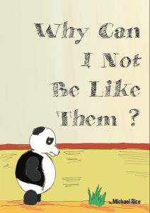
Finished piece – Children’s Book

Here’s my final piece! I’m fairly proud of it, the main part that I’m happy with is that of the style as it’s a huge improvement to the previous version. I prefer hand drawn to images drawn on a computer as I feel it’s more real. I’m happy with the colouring, it’s bright and attractive and the I feel eh story also gives off a positive message as well as being that of a fun, enjoyable read for children.

The PDF is as follows with the front cover as a taster.

Screen Shot 2016-04-21 at 18.19.22

Why Can I Not Be Like Them?


The Main Story – Picture Book

Here’s my final version of the overall story outline for the picture book.

Barry the Panda lived in a zoo,

and spent most days eating bamboo.

He lived with a friend named Rory,

and now let us begin our story.

– –

There were other animals that lived near him,

like a bright orange Tiger named Tim.

Then there was a Bird called Blanche,

who perched herself high upon a branch.

Sally the Salmon was always around,

but never joined them above ground.

– – –

Barry loved his friends an awful lot,

but there was something they had that he did not.

He was jealous of all the attention,

but thought it best not to mention.

People came to see his many friends,

meanwhile he just sat their until the day ends.

– – –

He wondered all day as to what it could be,

what makes them so special for others to see?

Then a lightbulb appeared over his head,

but it wasn’t something that could be said.

– –

The next day he walked up to the Tiger named Tim,

and a weird look was placed upon him.

“Why are you orange and black?”

“I want to be noticed like you and the pack”.

– –

Barry slumped back down and ate his bamboo,

he looked around and just didn’t know what he could do.

Then he looked up with a sudden thought,

and this time he wasn’t to be caught.

– –

Blanche was enjoying the sun.

until Barry walked over to spoil the fun.

Blanche noticed something odd about Barry’s fur,

so she decided to ask him about this weird spur.

“Why are you multicoloured, like me high up here?”

“I want to be noticed like you and feel clear”.

– – –

Once again Barry found himself alone,

he just sat there eating bamboo from within his home.

But for a third time he looked up to the sky,

as he’s got one more idea for which he can try.

– –

Swimming around and enjoying her day,

Sally looks up and has something to say.

“Barry why do you have scales on top of your hair?”

“I want to be noticed like the two of you there”.

– –

For a final time Barry returned to his home,

where this time he didn’t seem to be alone.

Rory was sitting close and chowing down on some bamboo,

he looked up and went to speak after every chew.

“Why do you insist on painting yourself?”

“I guess I’d like to be like everyone else”

– – –

“There’s no reason for hiding behind a mask.”

“Then what will get me attention and make people gasp?”

“You’re friendly. So be nice and people will notice.”

“That seems too easy, but I might as well try this.”

– –

Since this day, Barry hasn’t had to hide behind his friends.

He now knows that just being yourself is the best you can do.

Fonts! – Picture Book

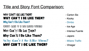
So here are some fonts that I decided on during the project. I gathered a range of different typefaces all in similar styles as this would give my enough space to lean back on if I chose to use different font styles. Below are what I got:

Screen Shot 2016-04-20 at 22.34.32

Out of all of the font types, I chose Milano Traffic for the title/cover type and Dimbo for the story text.

Font 1:  I felt this was a little too cartoon-y and I felt that it would be too hard to read while in big caps lock. I wanted something simple and easy to read.

Font 2:  This was reasonable and I considered it but I felt the boldness was too much weight for the pages, it created a vast amount on contrast between itself and the background images/the main pictures.

Font 3:  I decided to go with this font for the simple reason of it fitting nicely on the page. It presented itself perfectly and in my opinion I feel that it works with the pictures on the next pages. It’s easy to read and looks good in multiple colours.

Font 4:  I decided against this for the simple reason of it being to large and clunky.

Font 5:  I felt this font was similar to that of Dimbo but the lengths were too long, in my opinion this type face would stick out like a sore thumb.

Font 6:  I almost chose this one for the story text but felt it was too formal.

Font 7:  I selected this for the title font because I liked the handwritten look to it. It matched the style of the drawings slightly and looked the part, especially for a children’s book. I also needed something that stood out and I feel that this typeface does the job as it looks nice, sits boldly across the page and attracts attention.

Font 8:  I ignored this one simply because it looked too cartoonish. Too childish for the style of the story and design.

Completed Branding – Website

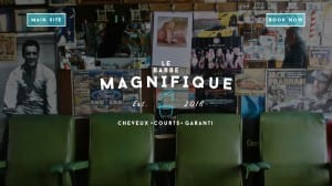
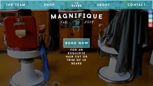
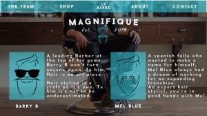
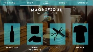
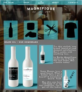
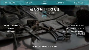
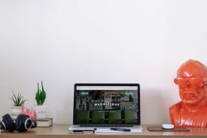
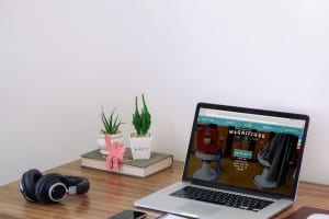
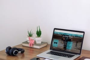
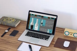
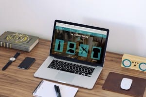
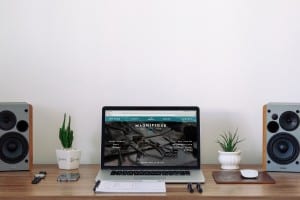
The website is now completely finished and up to the standards that I feel are acceptable for a business wanting to expand across the borders. Below are the final results in order in both desktop and mockup form.

Intro Page Home PageTeam Page Shop PageShop Page with Open Section Contact Page

Pg1 Pg2 Pg3 Pg4.1 Pg4 Pg5

The background images that I’ve used were acquired on Google.

I feel that, overall, the website has come out continuing that theme of a professional welcome. I’ve kept the colour palette consistent within the design and made sure to include various quirks across the website in order to keep that sense of quirkiness floating. I feel like i have successfully rebranded a company that plans to expand across the borders.

Thus brings an end to the brief.